Logo Design for 53 Martin Place Chambers
Clean.Simple
Barrister Chambers. Ultra-minimalist design focusing on address (Martin place has quite a few barrister chambers). Includes web design too. Balancing conservative and contemporary. Keywords: Legal Logo designs, Barristers Logo design, Branding, Legal website
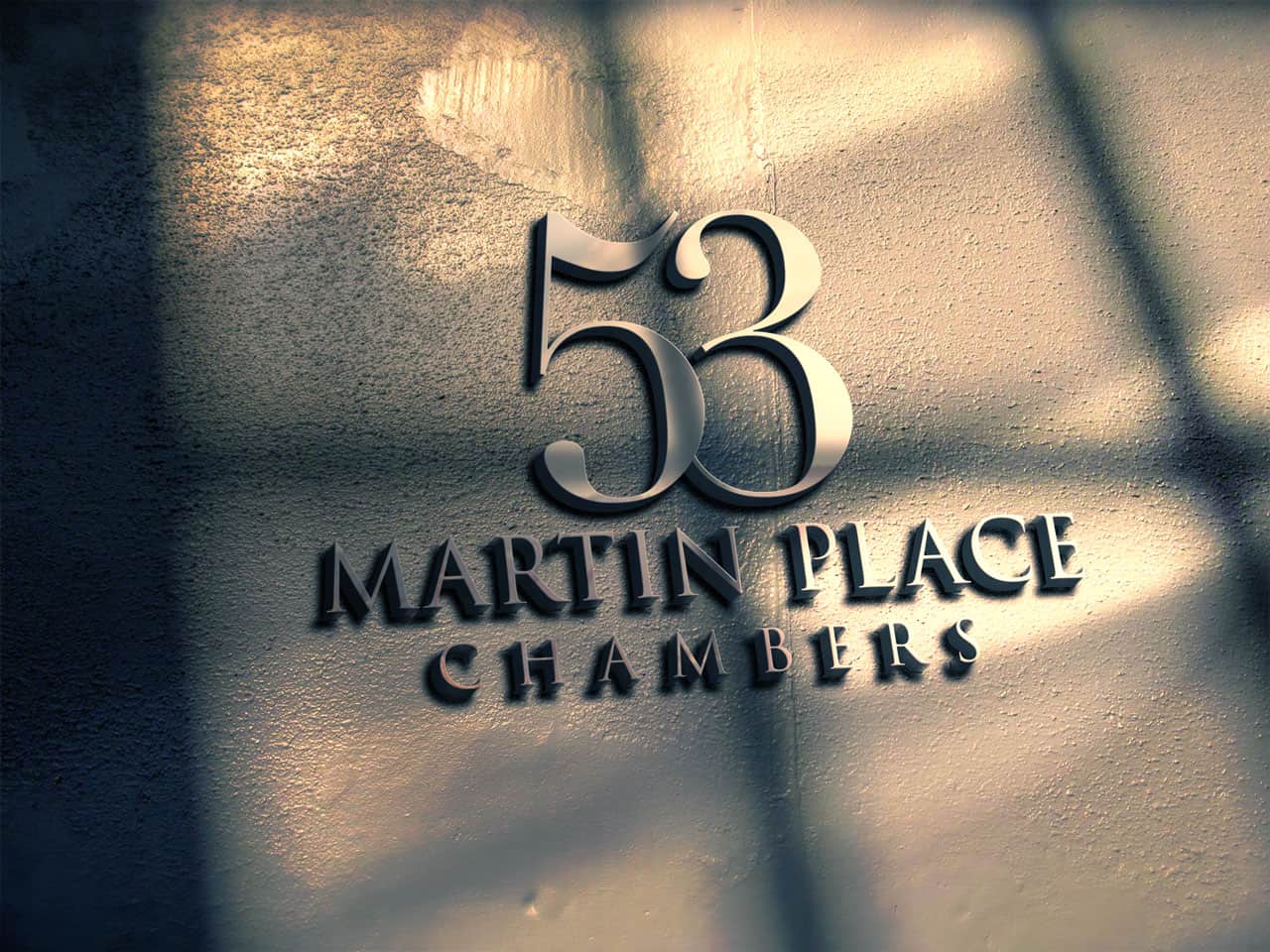
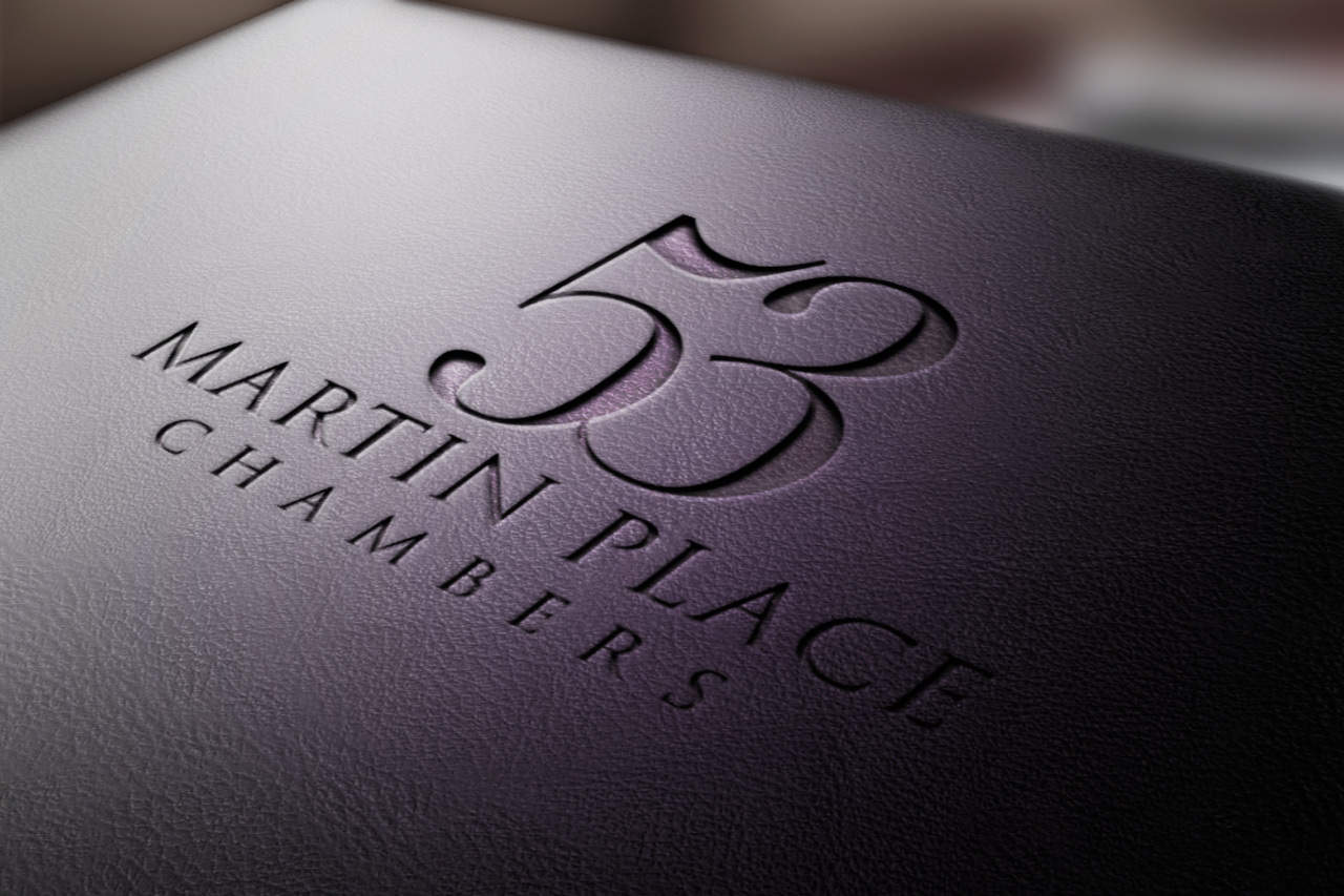
In this key Sydney legal precinct and building, five practicing barristers have been fortunate to obtain the perfect, ultra-minimalist name for their group: the building address. A legal logo needs to communicate identity, expertise and reliability. It needs to be instantly recognisable and memorable. The group’s diverse specialties required a Barristers’ Logo design that would work equally well for the group or each individual: a clean, neutral look to symbolise all areas of law, balancing contemporary expertise with conservative values.
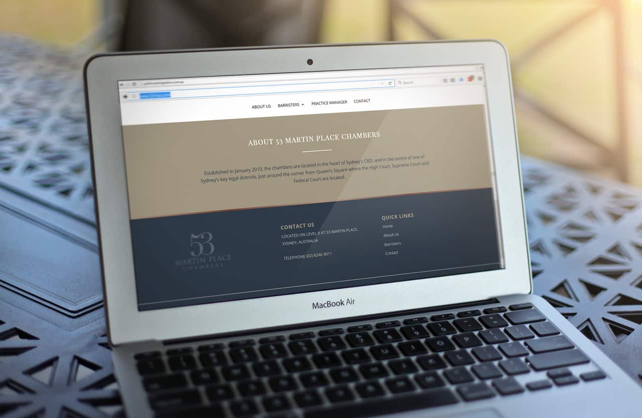
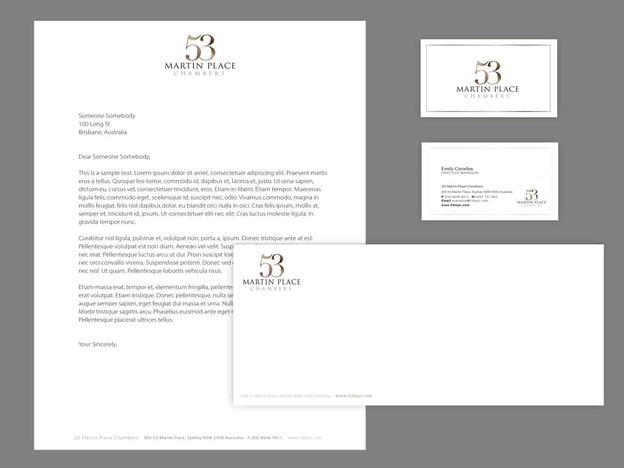
Lettering is a critical aspect of branding. Most people just take it for granted, but it communicates a powerful message. There are literally hundreds of thousands of fonts to choose from—each with their own individual emotion and ‘message’. We’ve used a stylish serif font that combines traditional style with an element of ‘flair’ and originality. The body of this legal website uses a complementary sans serif font that’s clean, modern and easy to read on any device.
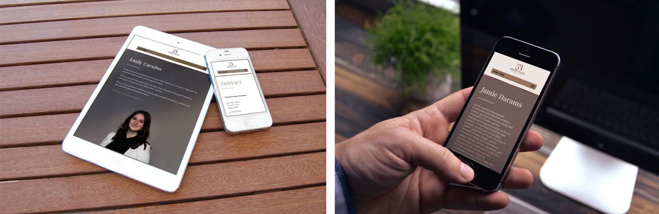
A legal website needs to use its branding, design and colour to communicate expertise, professionalism and approachability. Our calm, sophisticated palette of gold and grey for the lettering and background respectively, translates to a simple but powerful legal website design. It demonstrates that when the design is right, “less” is definitely “more”.