
Logo Design for Balwyn North Chiropractic Centre
We had a lot of fun imagining a logo for the warm, friendly chiropractors at BNCC. They pride themselves on their careful approach to testing, diagnosing and providing the right treatment. We’re amazed at how they can picture your entire skeletal and muscular structure inside your skin. All those bones, connected to one another! They described how the spine, the major joints, and all those connecting bones, ligaments and muscles work together. That’s when we imagined a human figure made up of tiny circles.
Clean. Simple.
Our integrated figure with its multiple parts has become a symbol of the detailed care BNCC’s chiropractors take with each patient. Then we wanted to suggest another aspect of their treatment: those gentle, healing hands. That’s when we imagined the smooth, stylised lines of the lettering.
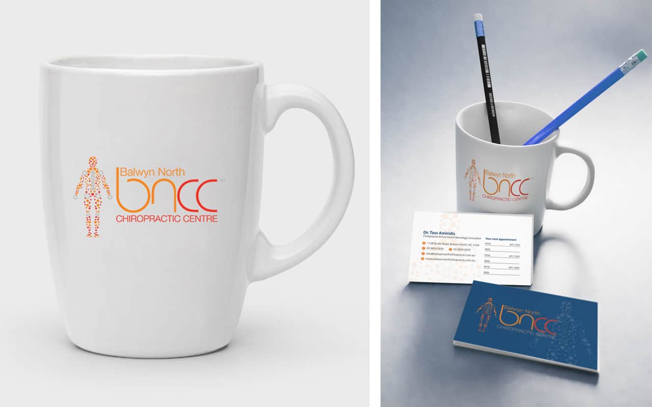
We chose warm colours for the logo and these are featured in the website as well. After all, no one like to have cold hands working on them! Then we teamed the warm red and orange with navy for a highly professional look and feel. The page design is clean, informative and relaxed. Just what a patient in pain needs.