Logo Design for ENT Clinics
Clean.Simple
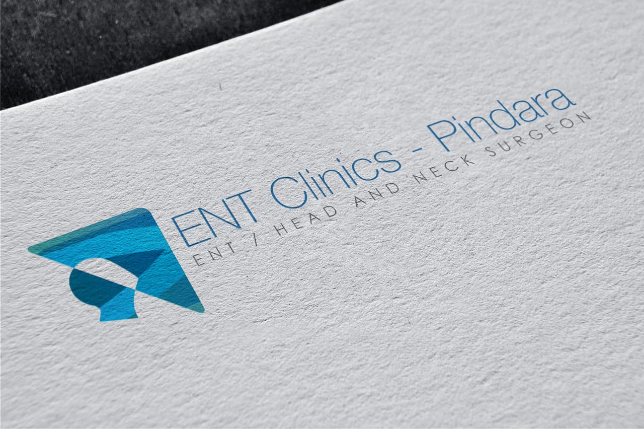
Ear nose throat. Logo design: negative space highlights area of surgery (much like an xray,) . Have since expanded to 6 locations from the original 3 surgeons.
This growing group of Ear, Nose & Throat and Head & Neck surgeons asked for a distinctively different logo. Something that would express what they do, but in a way that’s a little light-hearted, possibly even illuminating. We began with a head as the focus, highlighting the face with negative space, as an x-ray does. The triangle is a stylised beam of light, and its bands of blue extend to ‘wrap’ the head, in a symbol of ENT Clinics’ patient care.


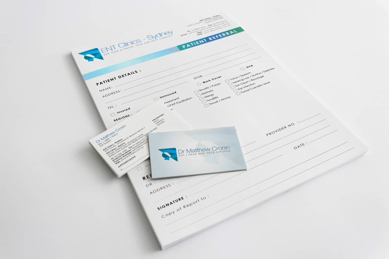
ENT Clinics has expanded significantly from the original group of three surgeons, and is now established in six different locations. Further clinics are planned. As each new clinic opens, distinctive and memorable branding links it to its colleagues. Recognisable group brand identity helps to communicate a strong message of high standards and credibility.