Logo Design for Airmarine

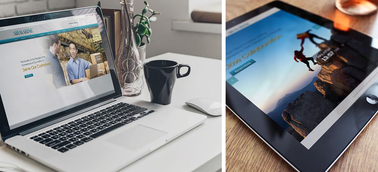
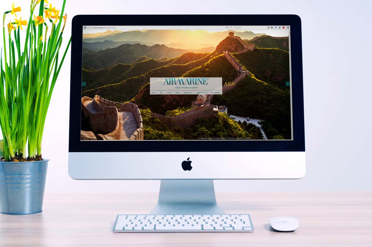
Airmarine is a global logistics company helping businesses address ever-demanding solutions in supply chain services.
The logo design for logistics companies is extremely important as the first expression of the brand precisely because people think visually using images. The logo must capture and visually communicate the core of brand’s value proposition to users of its services so it’s easily remembered and readily associated with the brand. Using AIRMARINE’s logo goals as our guide, we selected gradients of the colour blue from turquoise to deep blue to reflect the sky to the depths of the sea. Some colours are hard-wired to trigger specific emotions in most people. Blue is hard-wired to trigger feelings of tranquil serenity. This includes the subsets of honesty, experienced wisdom, and dedicated loyalty. In addition, blue represents the depth of AIRMARINE’s commitment to satisfied logistics partners. (Courtesy of Airmarine.asia)
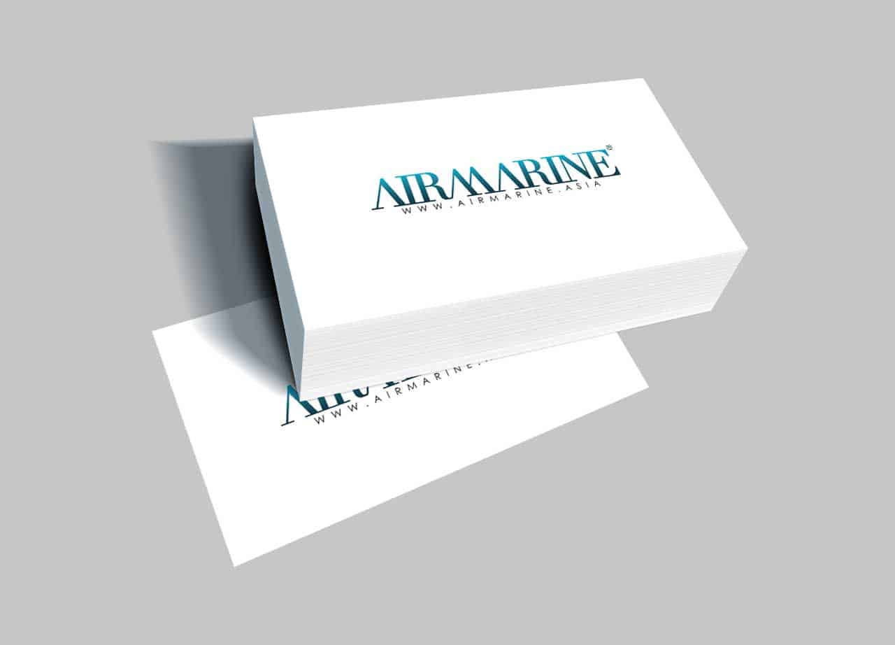
Clean.Simple
Nothing communicates simplicity in a logo faster than simple, unique typography. We used a typeface for
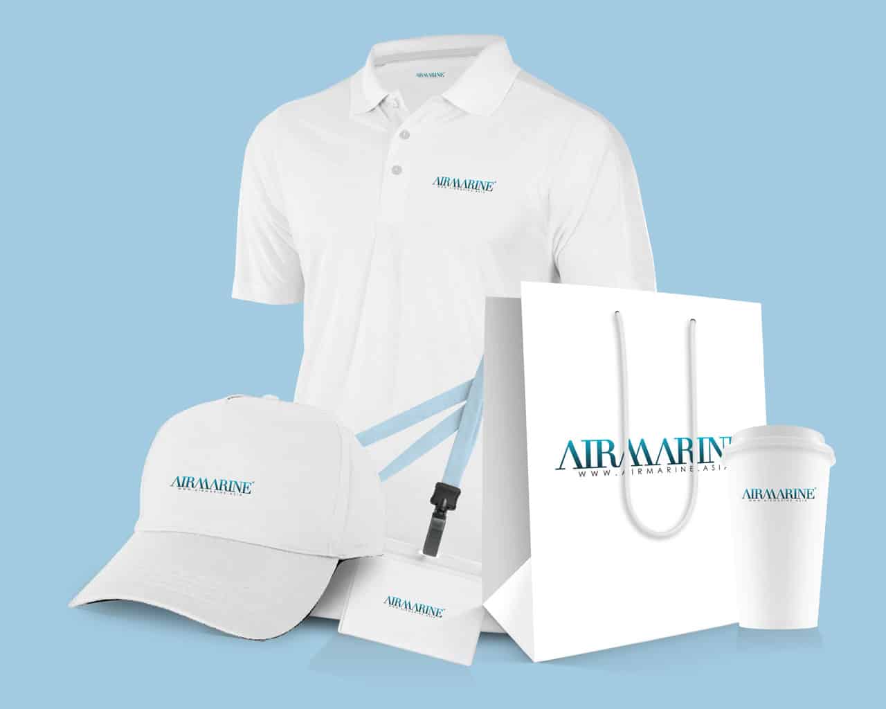
Airmarine precisely for that purpose. It is simple, unique, memorable and especially scalable. The Airmarine logo will look good when placed on everything, including print materials, t-shirts, billboards and trucks, regardless of the size it’s printed.
