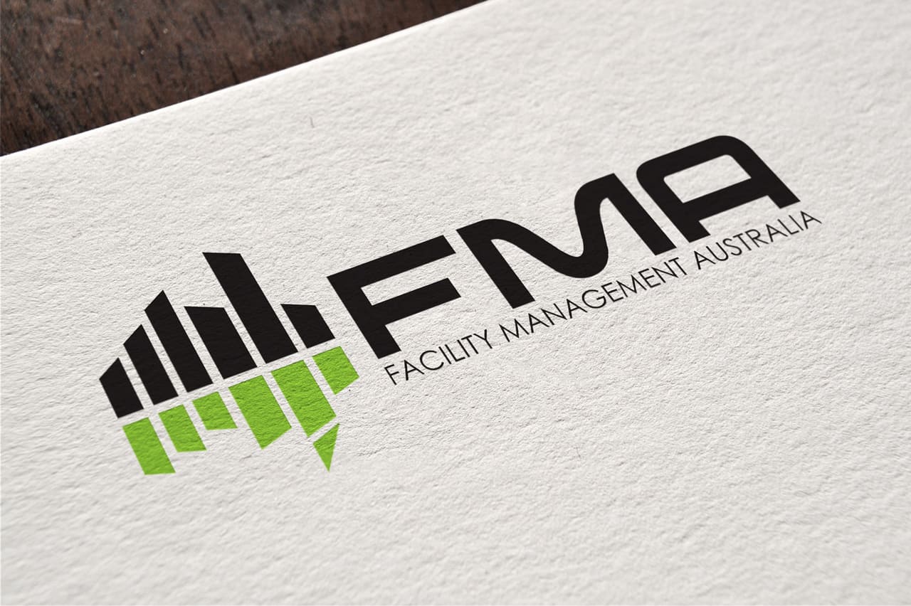
Logo Design for Facilities Management Australia
Logo design: buildings (short and tall) reflected to form Australia. Facilities Management Australia Logo Design: collaterals.
The Facility Management Association of Australia is the nation’s peak industry body for facilities management. It represents and supports professionals and organisations responsible for the operations management of Australia’s built environments. We were asked to create a logo that’s distinctive; that would work in the association’s relevant colours and across all its online and physical media.
Clean.Simple
We built a map of Australia from buildings of varying heights, then we stylised the association’s acronym to reflect the varied character of our urban landscape. We deliberately mixed squared corners with curves to emphasise the solidity and diversity of Australian building styles.

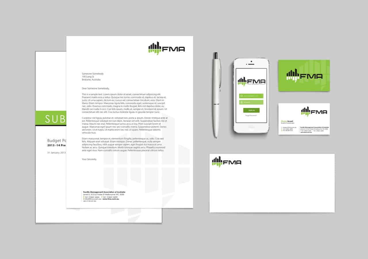
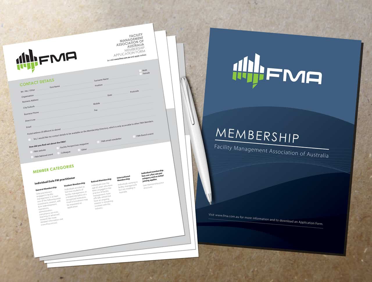
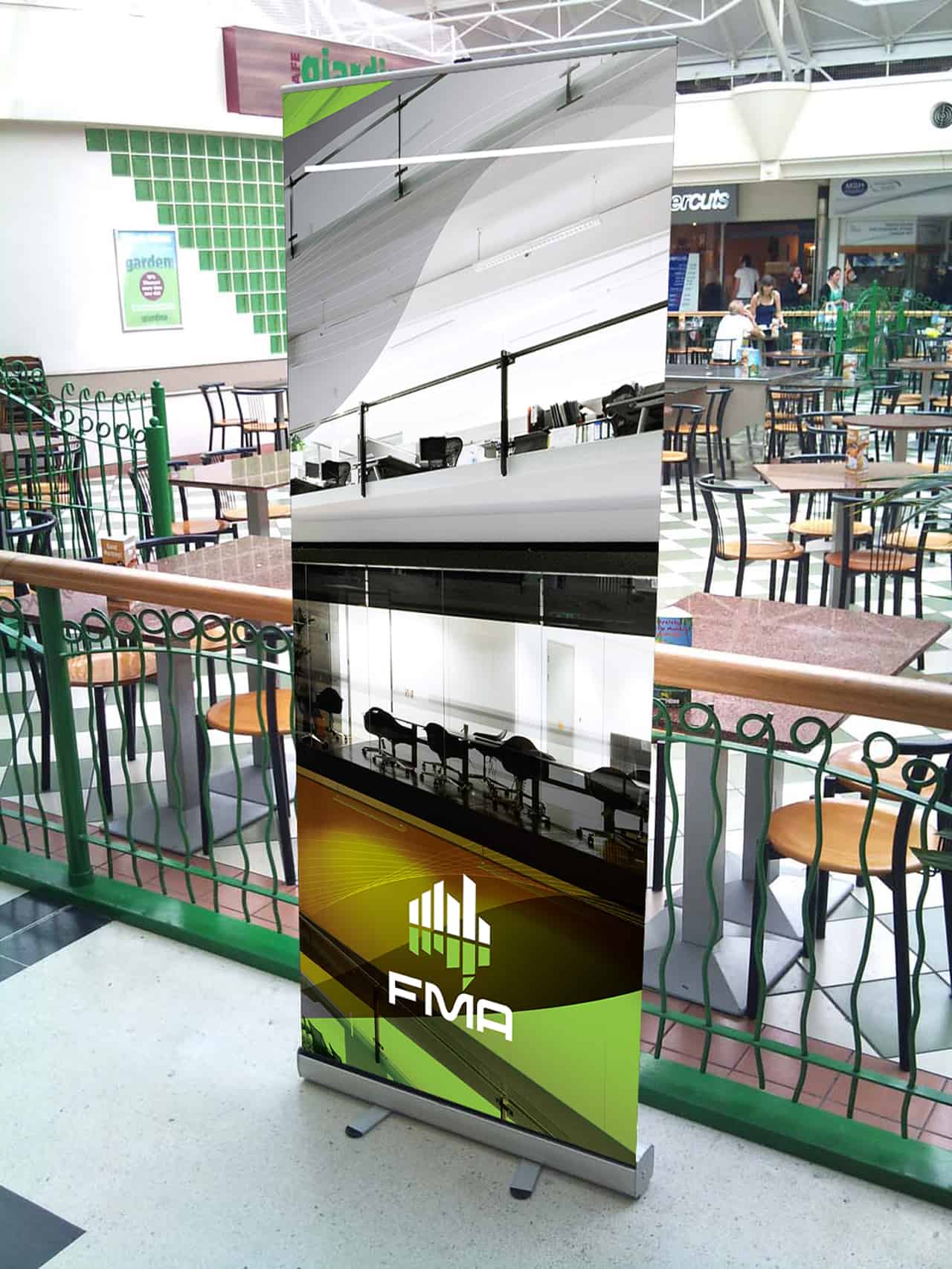
The logo needed to work in multiple situations, so we created a variety of options, all of which the association uses for various purposes. The logo can constitute white space against green (one of the association’s principle colours), or dark blue (used for some printed material). We also created a distinctive two-tone white and black logo, and another green and black. Colour versatility can be a way of keeping a logo fresh and interesting; it works in multiple ways for this association that offers such a wide variety of services to its members.
[]
1
Step 1