Logo Design for Gold Coast Paediatric Surgery
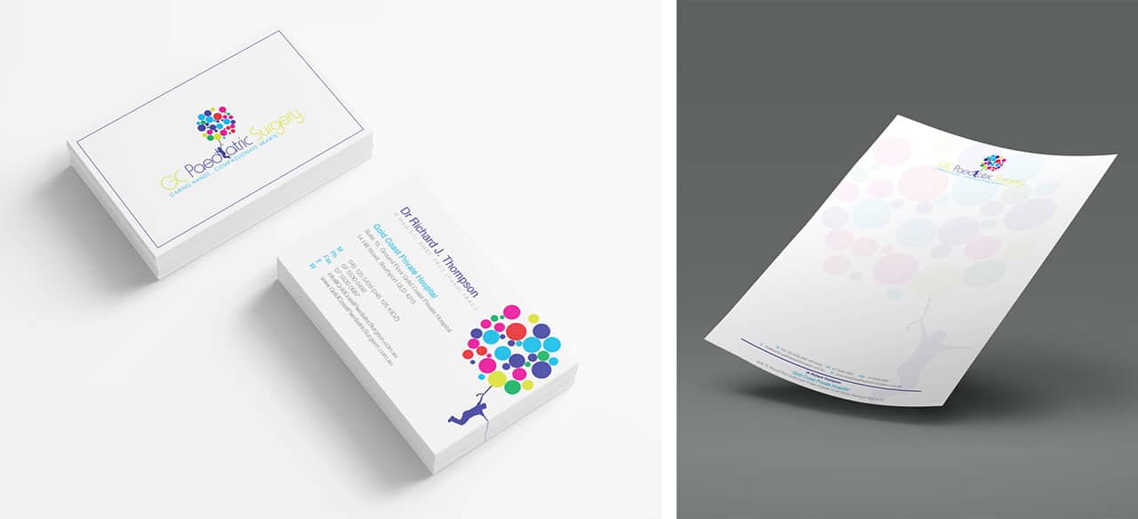
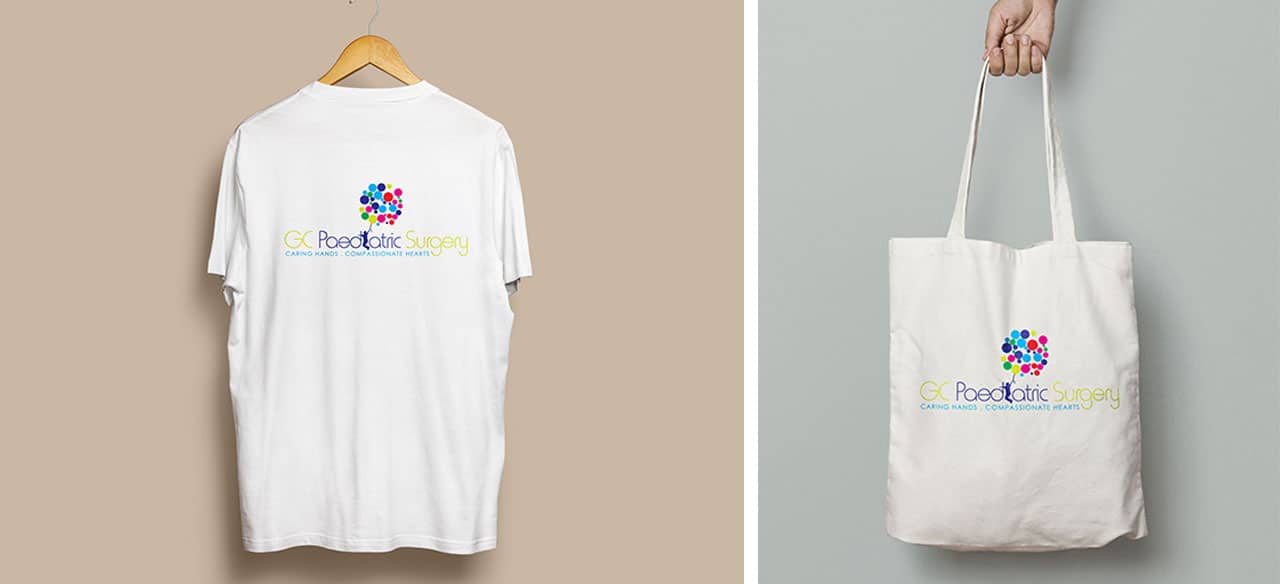
Surgeon Dr Richard Thompson is confronted every day with a parent’s nightmare: babies and children with problems requiring surgery. But as I thought more deeply about what he does, I realised that Richard’s work is all about transforming hope into joyful reality. My challenge was to translate that hope and joy into a logo, and then a website. What better way to represent the joy of childhood than a palette of bold colour! From those colours, our lovely multi-coloured balloons burst into life. A child with a clutch of balloons.
Sparking Joy
As a designer, my I want to communicate the culture and ethos of an business. Richard’s practice is a serious business aiming for joyful results. So we settled on a colour scheme of professional dark and light blues with lively touches of lime, green, red and cerise. And who needs an ‘i’ in “Paediatric” when you can have a child jumping for joy!
When it came to our design for the website, we had the perfect palette. Subdued blues, touches of lime, and blocks of lovely solid colour. The design for the site is simple and professional, in keeping with the serious nature of Richard’s work. But his goal for every child is the joyful energy of those balloons.
