Logo Design for Coorparoo Podiatry
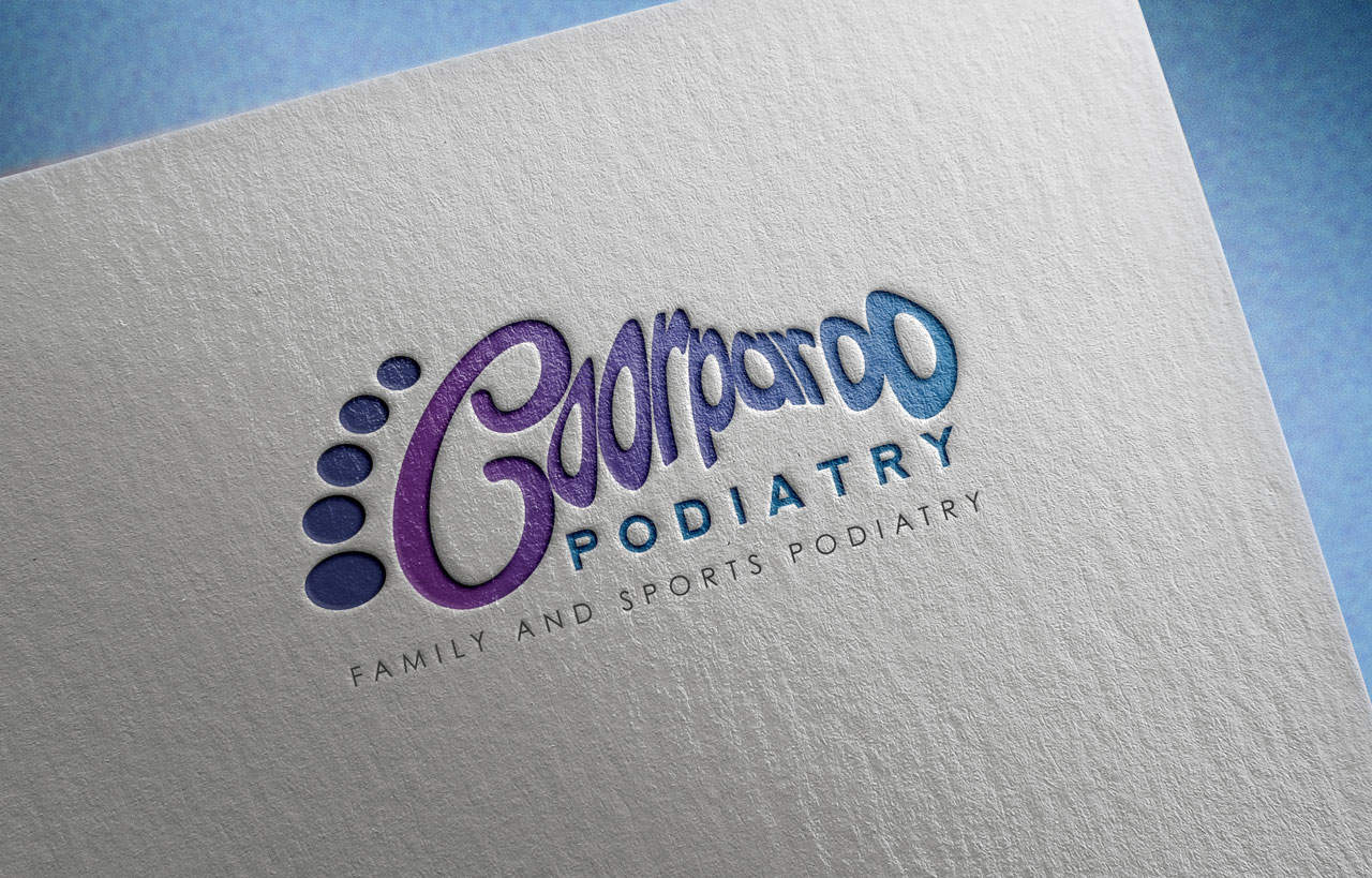
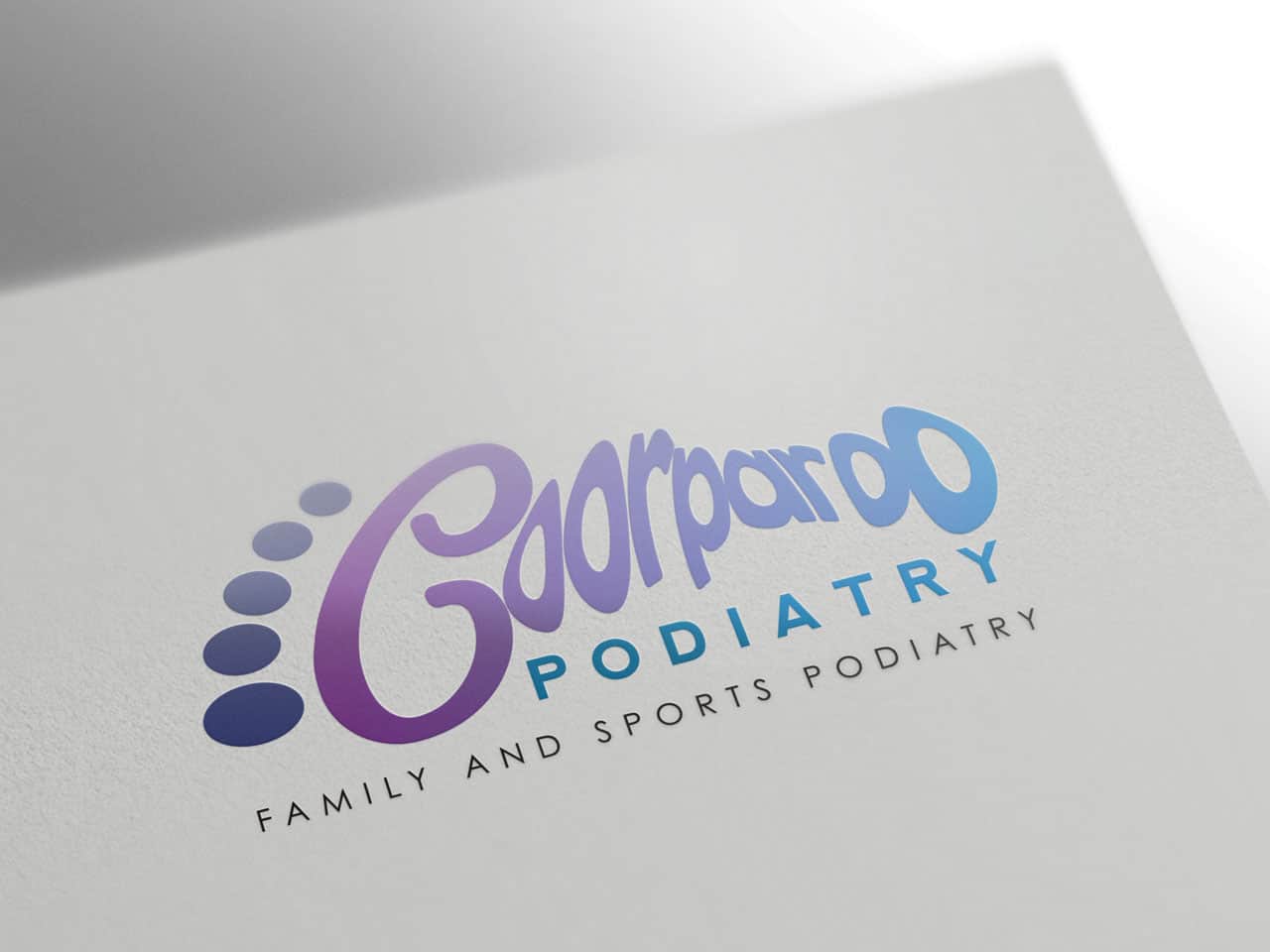
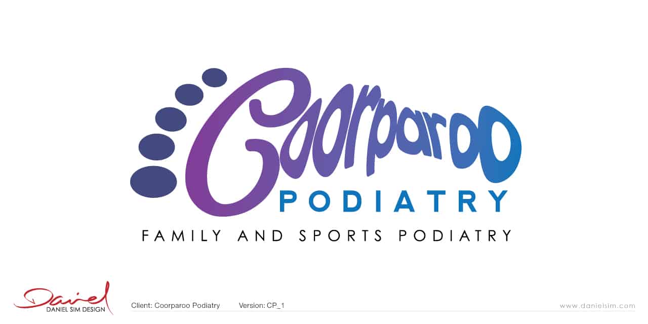
Concept 1: Logo Design for Coorparoo Podiatry
For this first design my idea was to create a new design … or a refined design based on the existing logo and stylised foot. I liked the idea of using just ‘Coorparoo’ as the wordmark but keeping the PODIATRY clear and concise. The logo works well with and without the tag line.


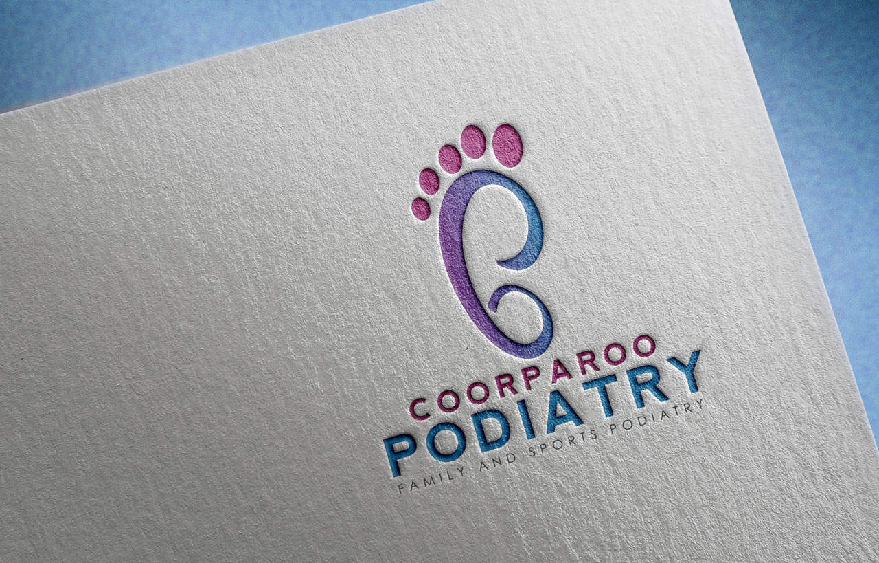
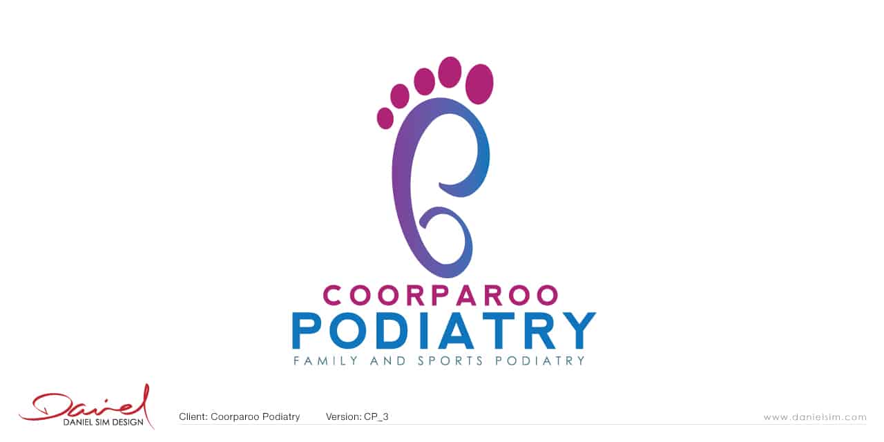
Concept 3: Logo Design for Coorparoo Podiatry
This concept came about when I was working on a symbol that could somehow combine the initials C and P within the shape of the foot. The larger Podiatry is intentional.
In Summary…
I hope you like the designs so far, and the ideas that formed them. Each concept have been rendered and mocked on various surfaces to give you a perspective of how each will look when applied. Once you have viewed the designs, please send your feedback to [email protected]. We will continue the conversation via email. I look forward to hearing from you soon. Regards, Daniel Sim PS: Please note that all copyright and ownership of presented designs and ideas remains the property of Daniel Sim until the final payment is confirmed for project. They are not to be distributed or displayed publicly without prior permission. Failure to comply will result in a breach of copyright.
[]
1
Step 1