Logo Design for Emmaus Grace Experience
Hi Trev, Jeremy, I’m now pleased to present my design concepts for Emmaus Grace Experience.
Each logo created is approached with the larger brand perspective in mind, how it appears on print, signage, print, digital media, presentations and various other applications.
Aim was to have a design that is very clean, minimal and meaningful.
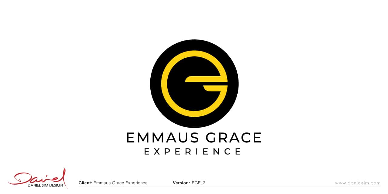
Concept 2: Logo Design for Emmaus Grace Experience
This 2nd design again works with the idea of combining the EGE together. The top half represents the E and the lower half G.
It also tells the story of the Emmaus journey where after they reached Emmaus and their eyes opened, they turned back towards to Jerusalem to tell of the good news.
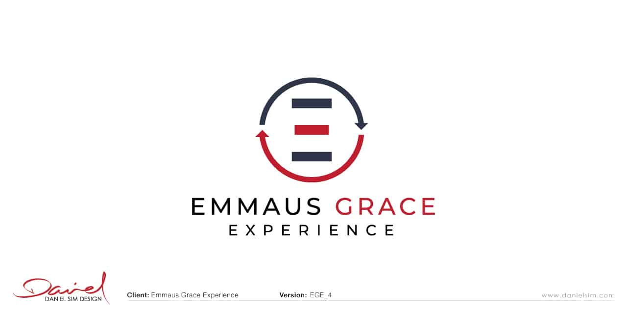
Concept 4: Logo Design for Emmaus Grace Experience
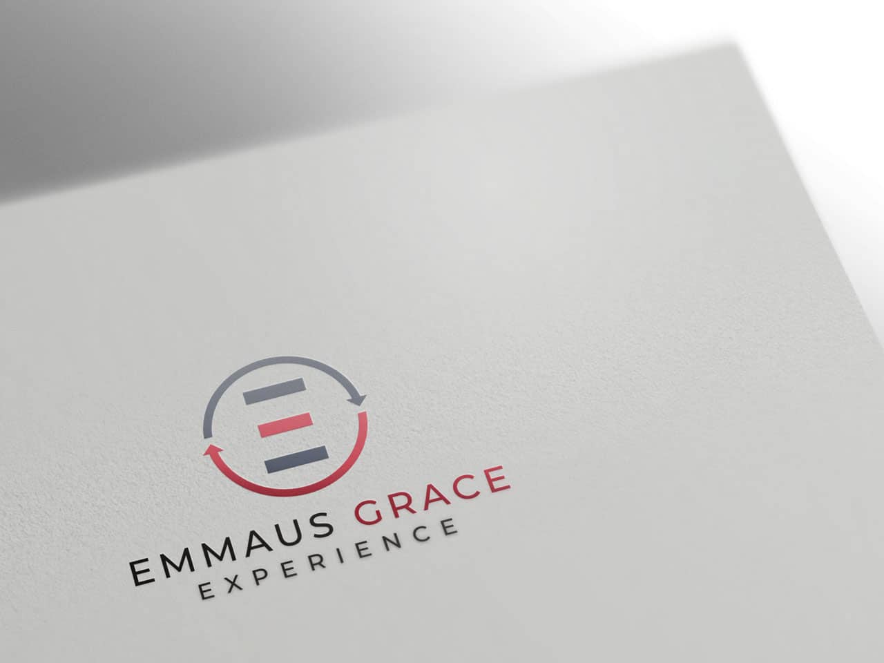
This is an abstract ‘E’ within the arrows depicting the journey. It’s also a very subtle reference to the 3 figures on this journey (Jesus at the centre of the 2 disciples).
Red arrow back is also intentional as it correlates with the centre figure.
In Summary…
I hope you like the designs so far, and the ideas that formed them. Each concept have been rendered and mocked on various surfaces to give you a perspective of how each will look when applied. Once you have viewed the designs, please send your feedback to [email protected]. We will continue the conversation via email. I look forward to hearing from you soon.
Regards,
Daniel Sim
PS: Please note that all copyright and ownership of presented designs and ideas remains the property of Daniel Sim until the final payment is confirmed for project. They are not to be distributed or displayed publicly without prior permission. Failure to comply will result in a breach of copyright.

