Logo Design for NWTL Group
Hi Jim, I’m now pleased to present my design concepts for your new logo.
Each logo created is approached with the larger brand perspective in mind, how it appears on signage, print, digital media, menus, uniforms and various other applications.
My aim for this particular project was to create a logo or an icon that would reflect a high level of proficiency, sense of synergy and heritage.
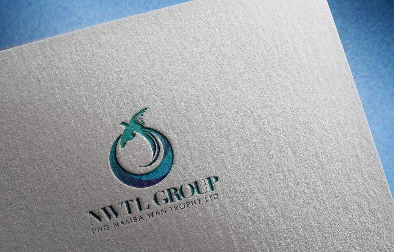
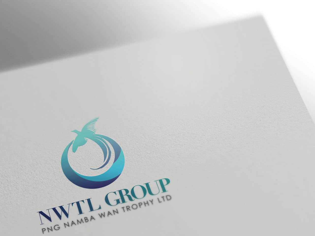
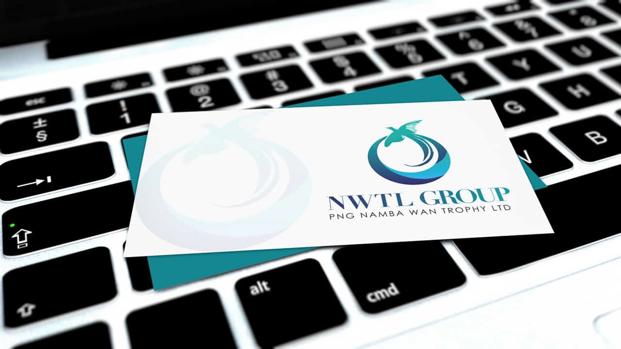
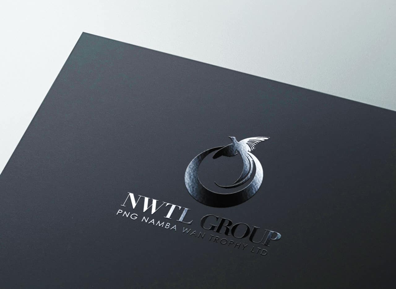
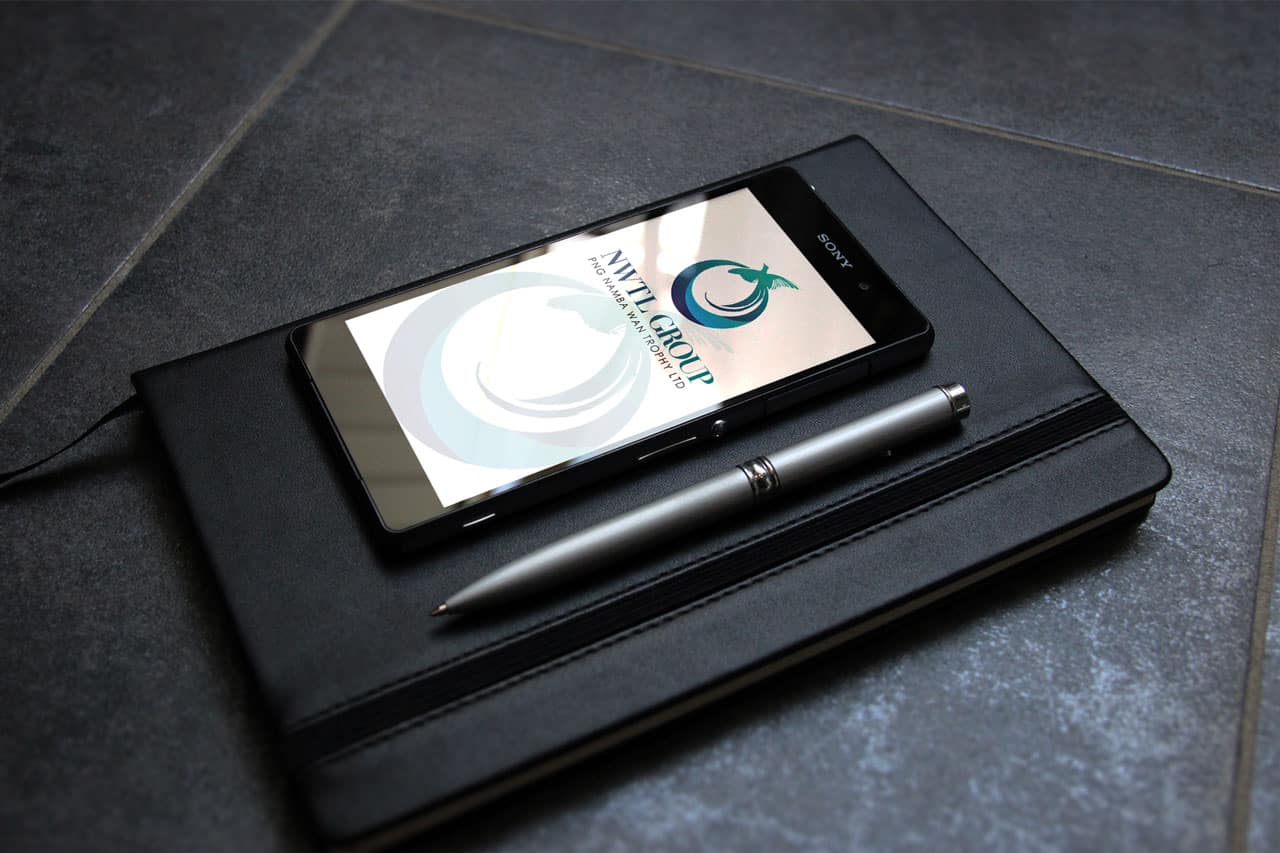
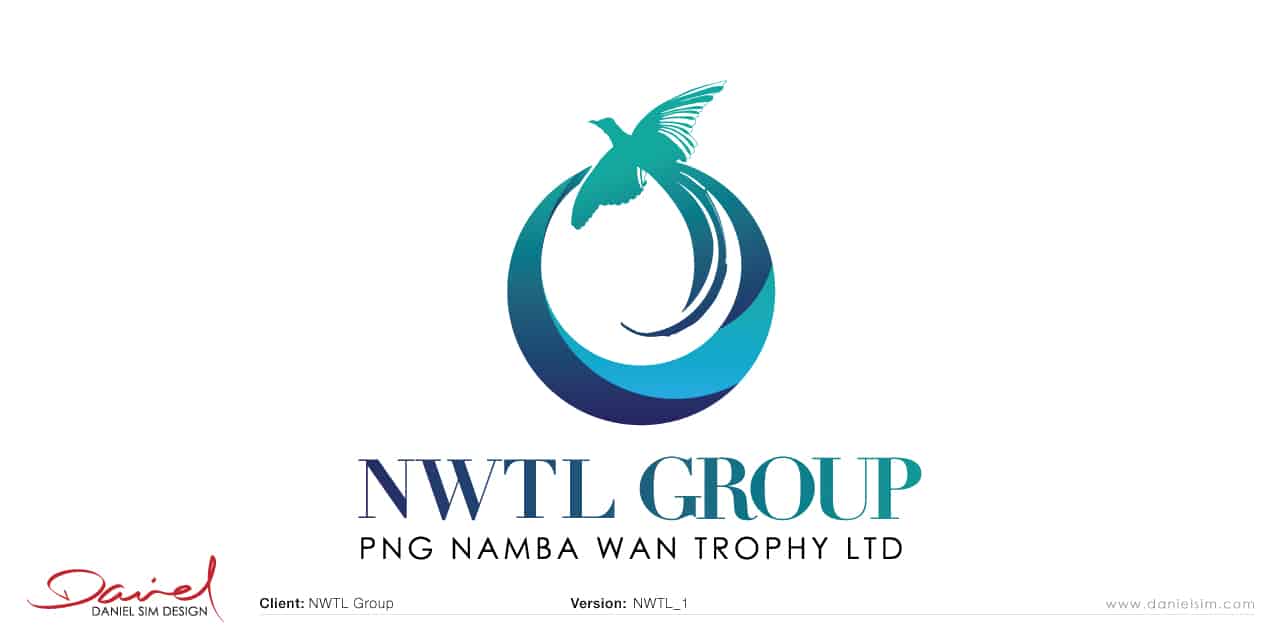
Concept 1: Logo Design for NWTL Group
For this first design my idea was to create a dynamic circular icon that could represent the group as a whole. I wanted to capture a sense of movement as the company seems to be continually growing and expanding. I wanted to use the bird of paradise to represent the geographical heritage rather than the map of PNG as I do see the company expanding beyond.
I’ve hand picked this typeface to compliment the icon, I have also used this colours as it provides a sense of trust and growth.
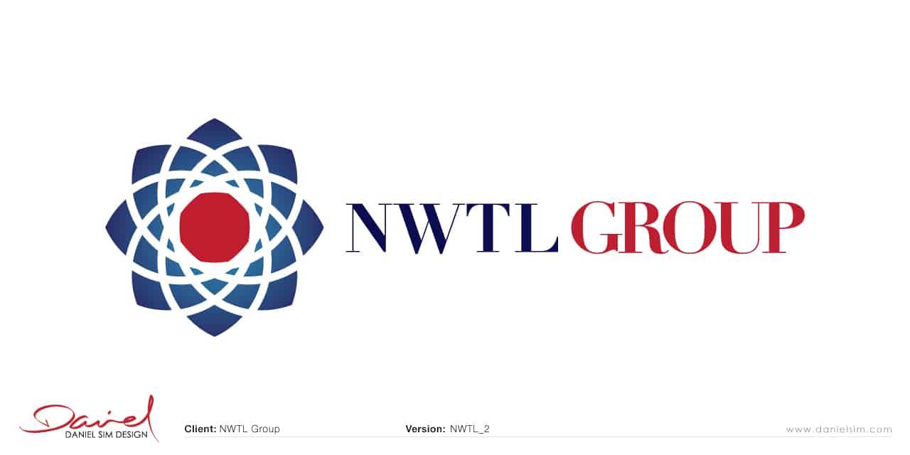
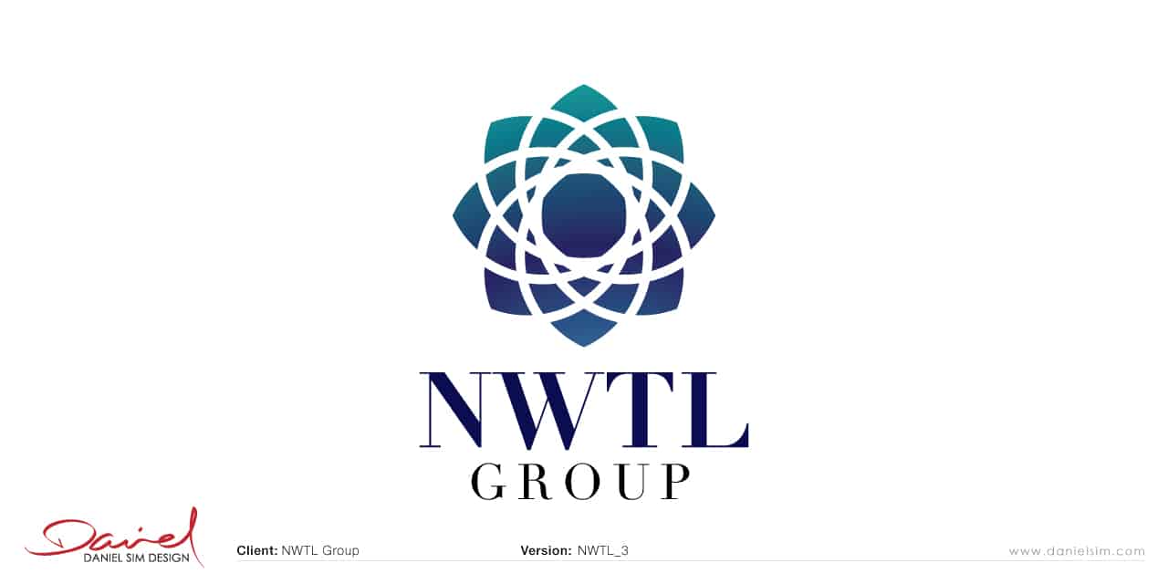
Concept 2: Logo Design for NWTL Group
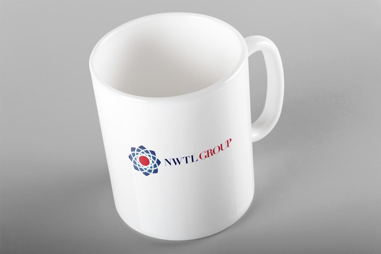
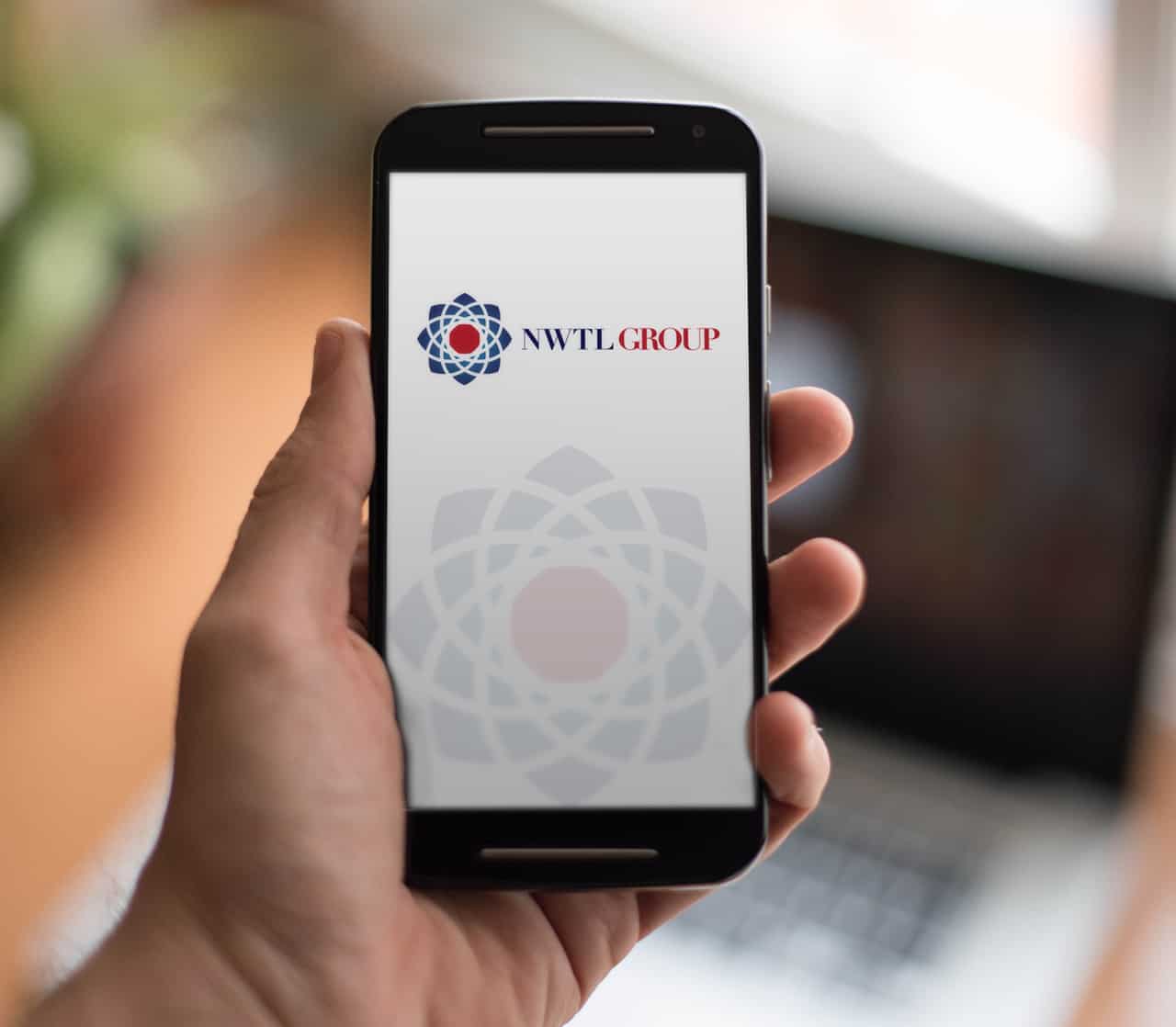
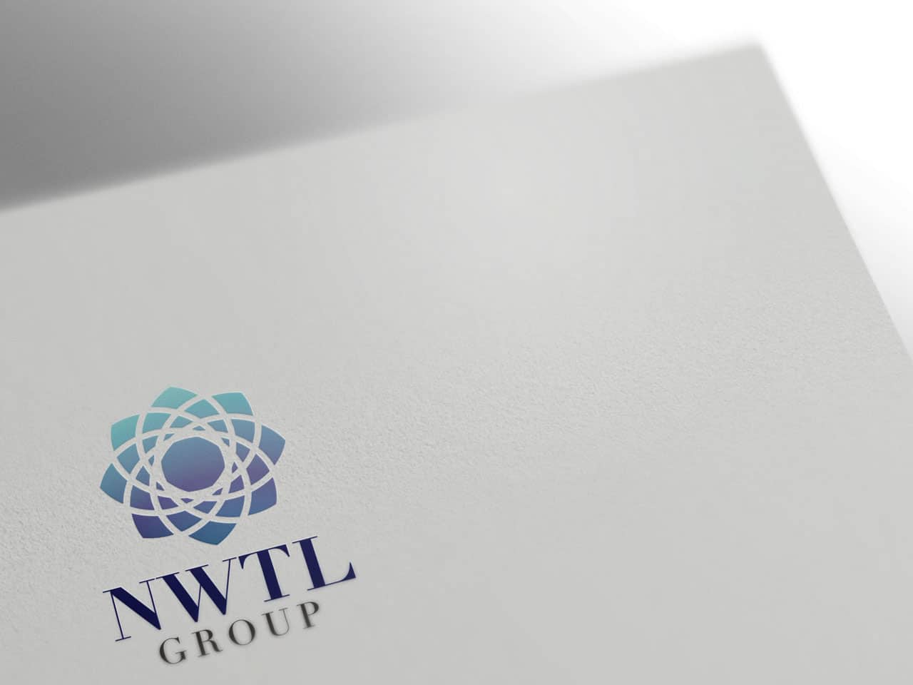
For this 2nd design, I wanted a follow the circular theme. The idea behind this design was to create a sense of interconnectivity around a core (values, beliefs, family). I wanted the icon to resemble the top view of a flower (associated with nature, PNG).
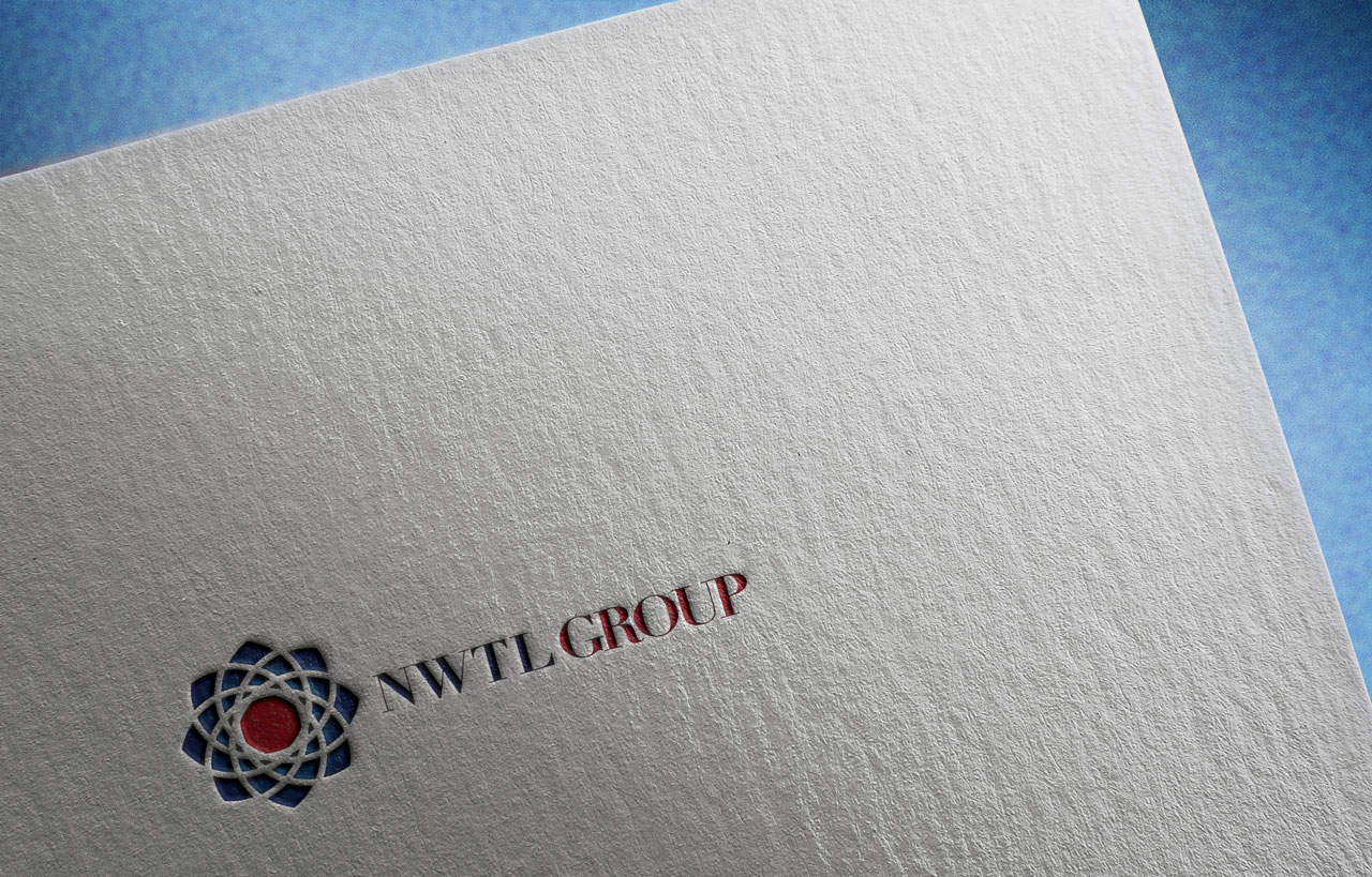

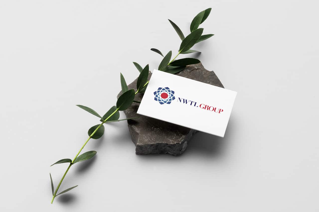
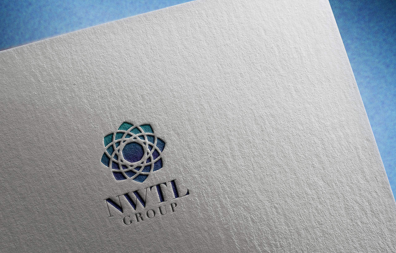
Concept 3: Logo Design for NWTL Group
Here’s an alternative layout and colour for the above concept.
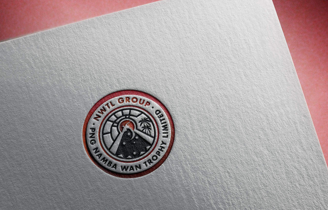
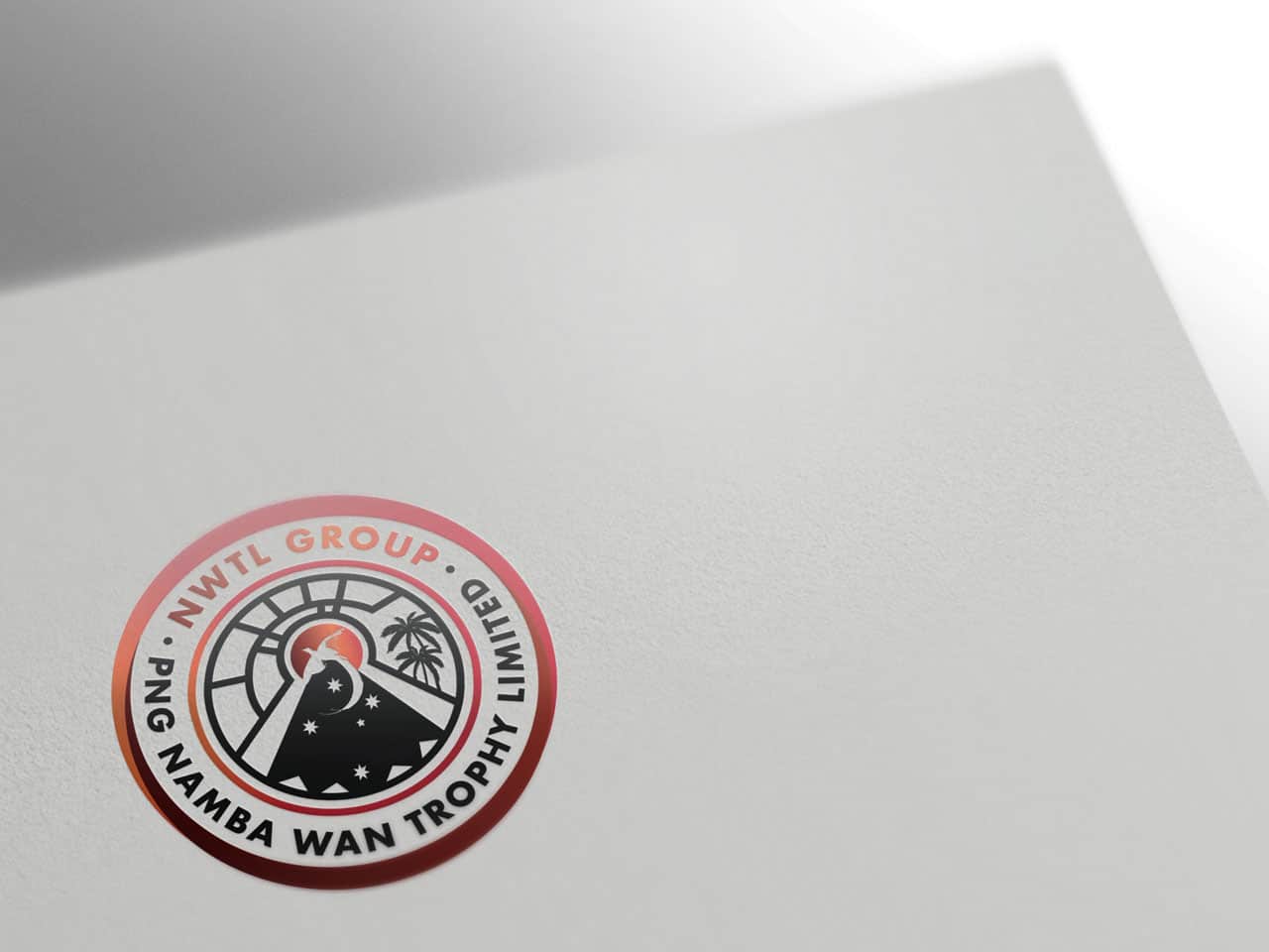
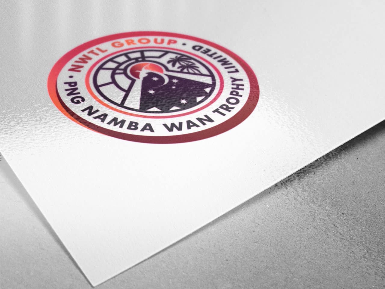
Concept 4: Logo Design for NWTL Group
Here’s a design that aims to use part of the existing design but create it in a way that reflects the company moving forwards.
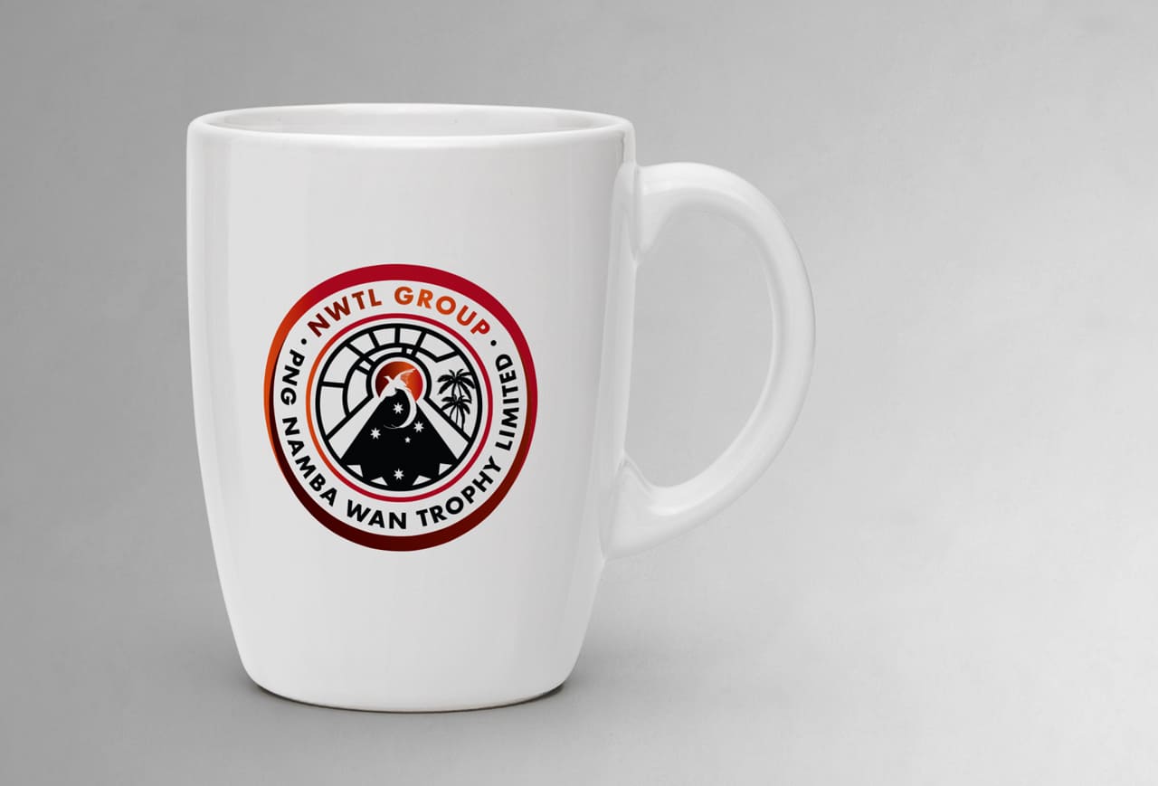
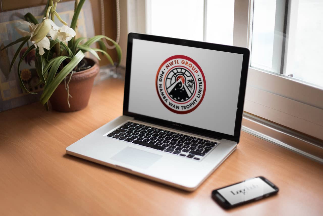
Each part of the design has a meaning, from the Bird of Paradise above the Mountain ranges (reflects PNG and the idea of achievement, be it sports or commerce). The palm trees represent growth, industry, products and the lines above shows a sense of connectivity, wireless communications.
The idea is that the design will stand the test of time and allow for future growth and subsidiaries.

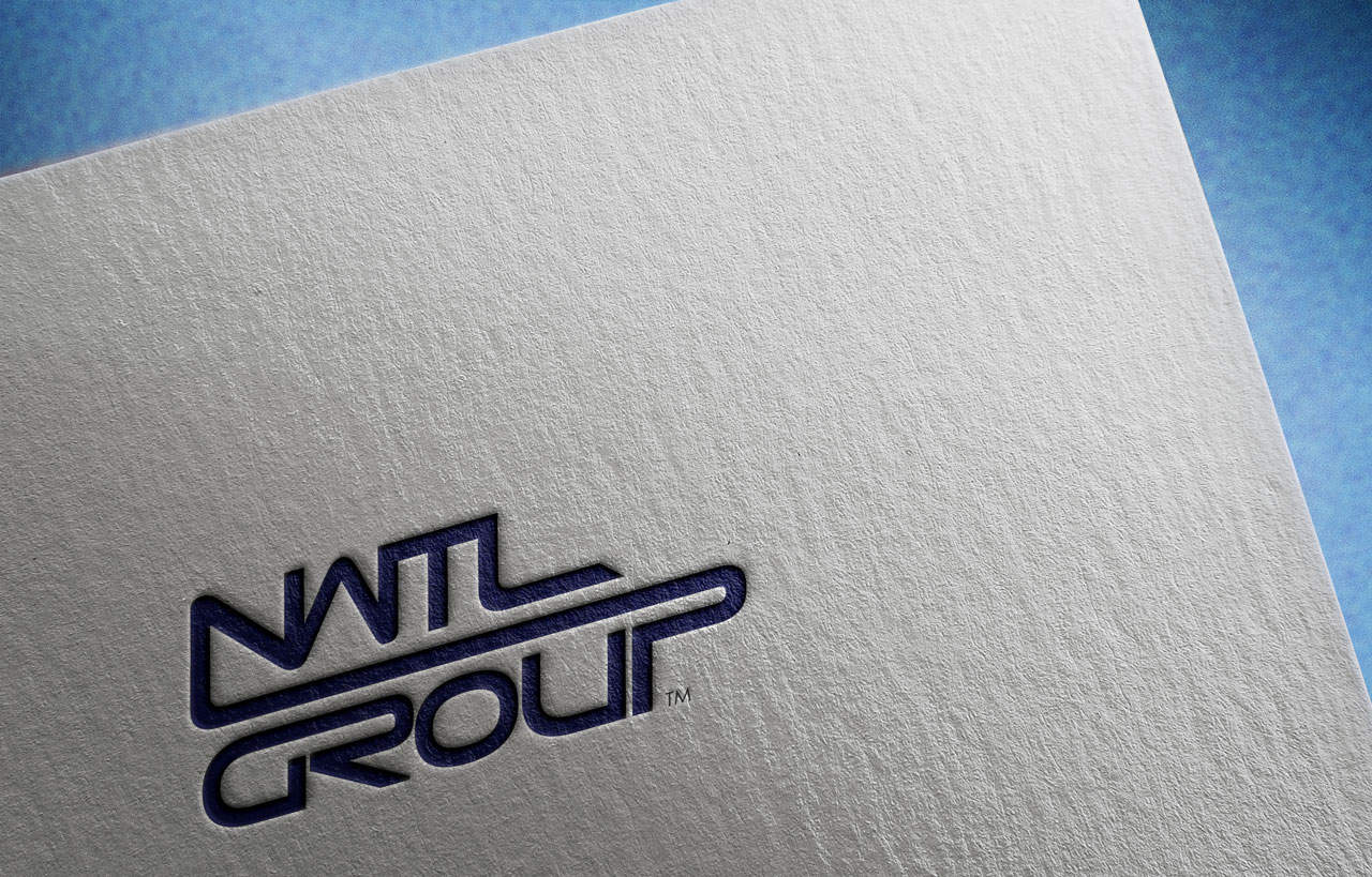
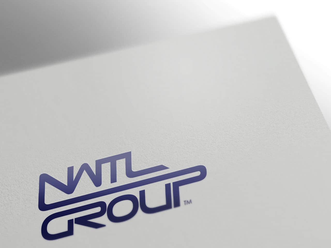
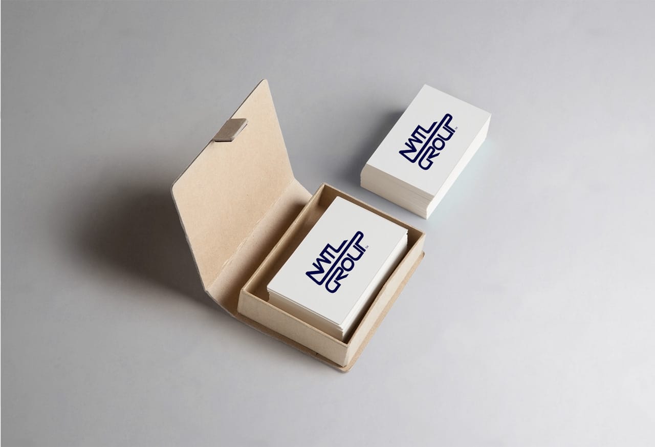
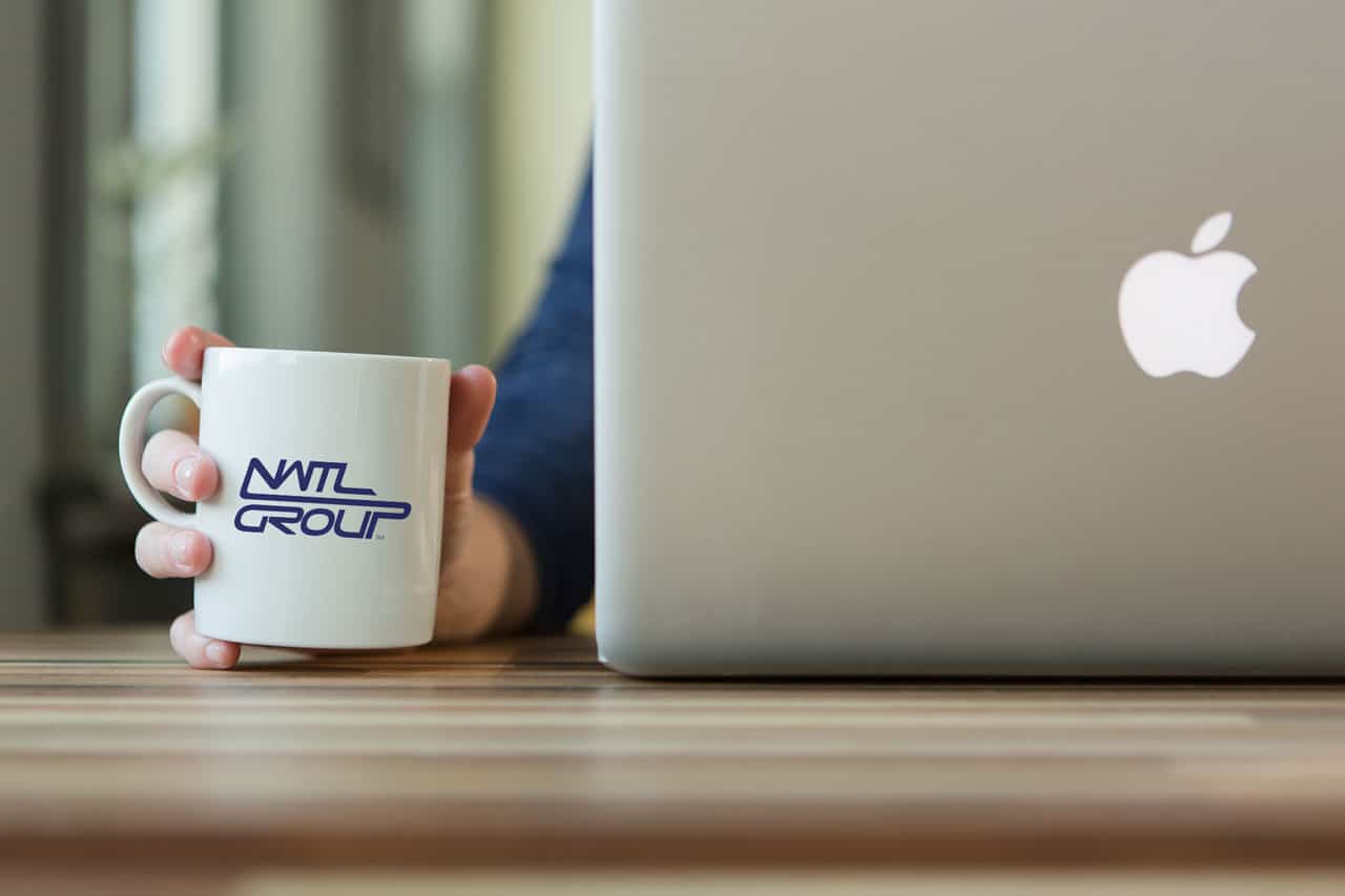
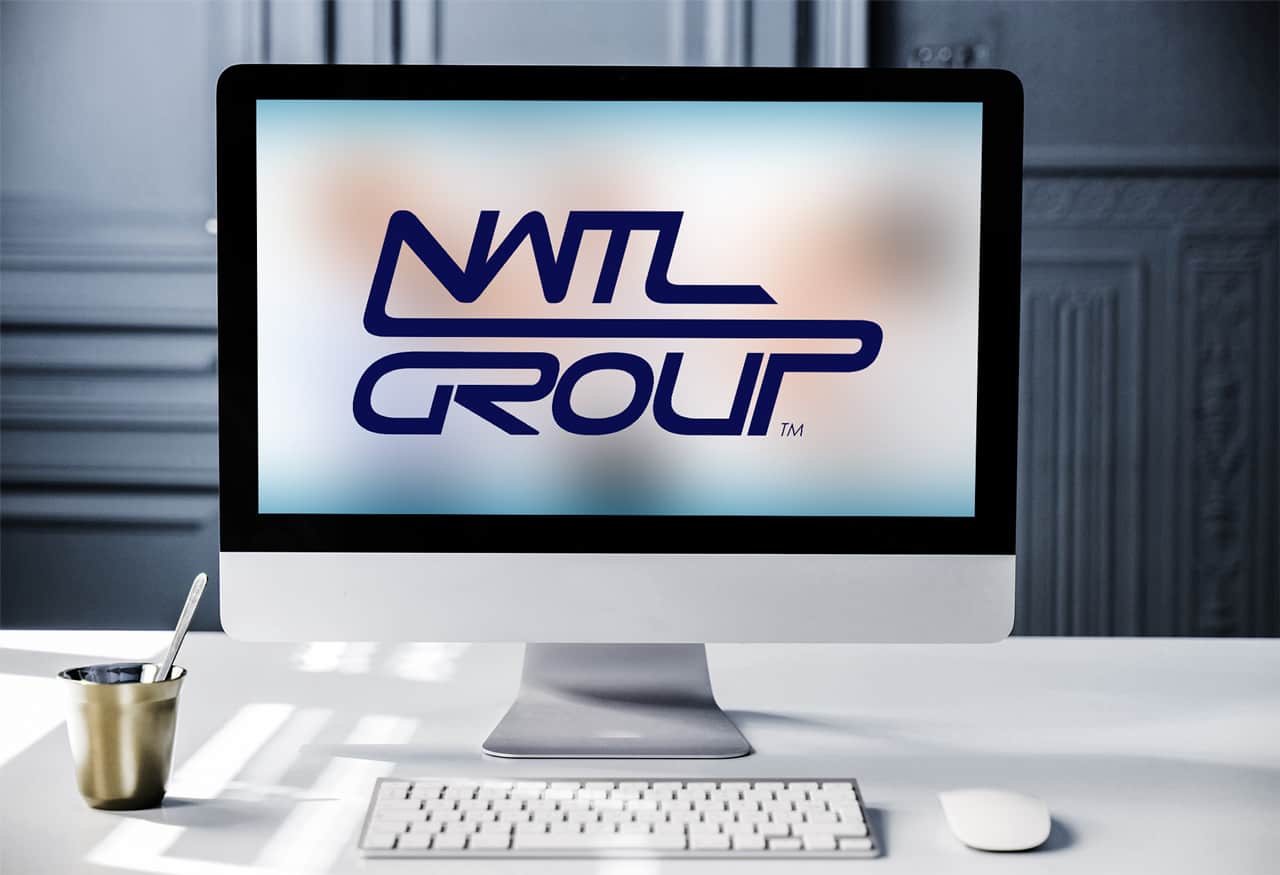
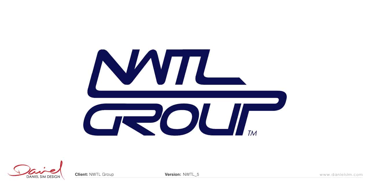
Concept 5: Logo Design for NWTL Group
Here’s a design that I wanted to include as you mentioned you liked the very minimalist wordmark style (you mentioned Fone Haus).
The idea behind the design was to show the link between the letters but also to provide a sense of movement to the logo. The slight incline is intentional to give a perception of forward movement.
In Summary…
I hope you like the designs so far, and the ideas that formed them. Each concept have been rendered and mocked on various surfaces to give you a perspective of how each will look when applied. Once you have viewed the designs, please send your feedback to [email protected]. We will continue the conversation via email. I look forward to hearing from you soon.
Regards,
Daniel Sim
PS: Please note that all copyright and ownership of presented designs and ideas remains the property of Daniel Sim until the final payment is confirmed for project. They are not to be distributed or displayed publicly without prior permission. Failure to comply will result in a breach of copyright.