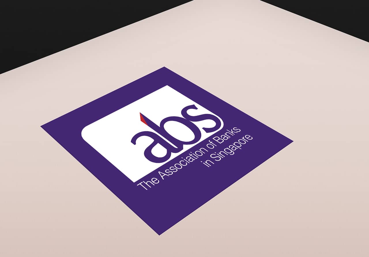
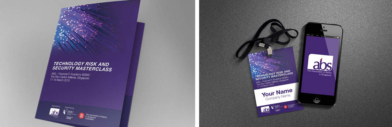
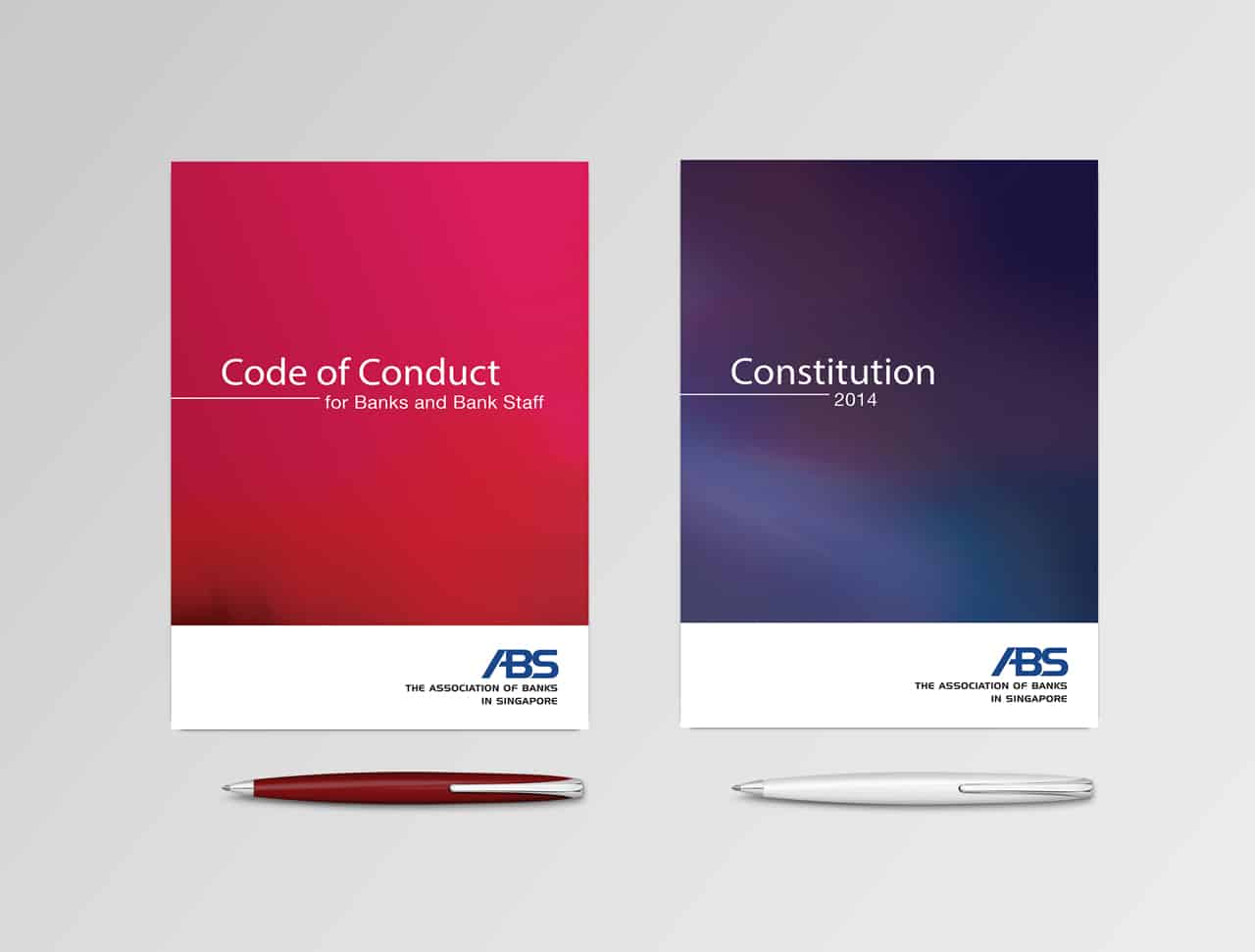
Logo Design for The Association of Banks, Singapore
The Association of Banks in Singapore is a non-profit organisation that represents the interests of 156 local and foreign banks, financial institutions and representative
offices operating in Singapore. A key aspect of its role is to uphold the integrity of members, and to ensure they operate within international best-practice standards.
Our brief was to create a logo the reflects the responsibility, high standards and inclusiveness of this Association.
Clean.Simple
Our design uses a solid rectangle with the subtle rounding of opposite corners. The message is that this organisation operates within strict, but creative parameters. The lower-case letters nestle into one curve, giving a pleasing visual balance. Every detail is meaningful: the letters are intentionally linked to communicate the sense of unity and partnership that is part of the ethos of the Association.
ABS is a powerful repository of guidelines and industry advice. We added subtle touches to the logo designed to communicate precision, accuracy and detail. Note the pointed ‘B’ with its detail of a red triangle. It contrasts neatly with the rounded lettering of the words. Unified, rounded and approachable meets defined, precise and clear. The Association strives to achieve the best and most professional combination of all these qualities.