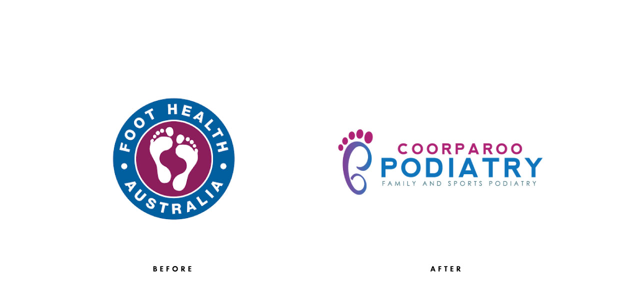
Logo Design for CoorparooPodiatry
I’m a proud dad of four beautiful children, so I was really happy to be asked to design a logo for the early motherhood support organisation Pregnancy Birth and Beyond. The experience of bringing a new life into the world is amazing, and we wanted to represent its beauty and grace in our design. As we improvised with ‘P’ and ‘B’, we watched our lines begin to represent a woman’s shape as her pregnancy progresses. They are beautiful and graceful. The space protected by the curves represents that safe space where a baby grows and develops.
Clean.Simple
So we had the lines. Next, we needed to choose a colour. The blue represents the watery environment where a baby spends its first nine months. It’s also an exquisitely beautiful colour. Blue blends into subtle greys to enhance that feeling of fluidity.
Our blended colours are a way of representing pregnancy and motherhood as a part of nature, morphing from one state to another, constantly changing and developing. We chose a traditional serif font for our lettering. Like motherhood, it’s graceful and beautiful.
