Logo Design for Hope International Ministries
Clean.Simple
www.facebook.com/byHIM.Org and www.byhim.org
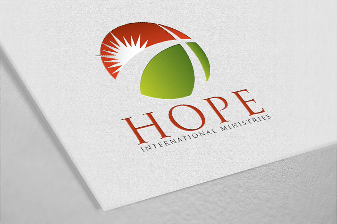
Logo design: the idea of hope, sun rises again, elements of the cross reaching around the globe (mission), the subtle fish or ichthus (christian symbol). The sun contains 12 rays (12 discliples) one of the core mandates were discipleship and training.
Hope International Ministries is a Christian ministry with a vision to “plant vibrant, biblical churches…all over the world.” They asked us for a logo that would reflect the core mandates of discipleship and training in a Christian ministry. The logo had to work in colour or reverse. We also learned how important was the word “Hope”, and the reason for its inclusion in the ministry’s name. It encapsulates its vision to communicate hope and certainty that life has meaning and purpose, and that there is Someone in control.

We came away from our briefing with a clear vision for the elements we wanted to draw together: the cross (the key symbol of Christianity), the world (as the goal of the ministry), the sun (to represent light and hope).

As we built the concept, other ideas meshed with these three. The stylised cross also represents pathways across the globe, and hints at intersecting arcs forming an ichthus (the ‘fish’ that was one of earliest Christian symbols, and still used today). One of these pathways also forms a horizon for the rising sun. In a reference to ‘discipleship’, we designed a sun with 12 rays – the original number of Jesus’ disciples.