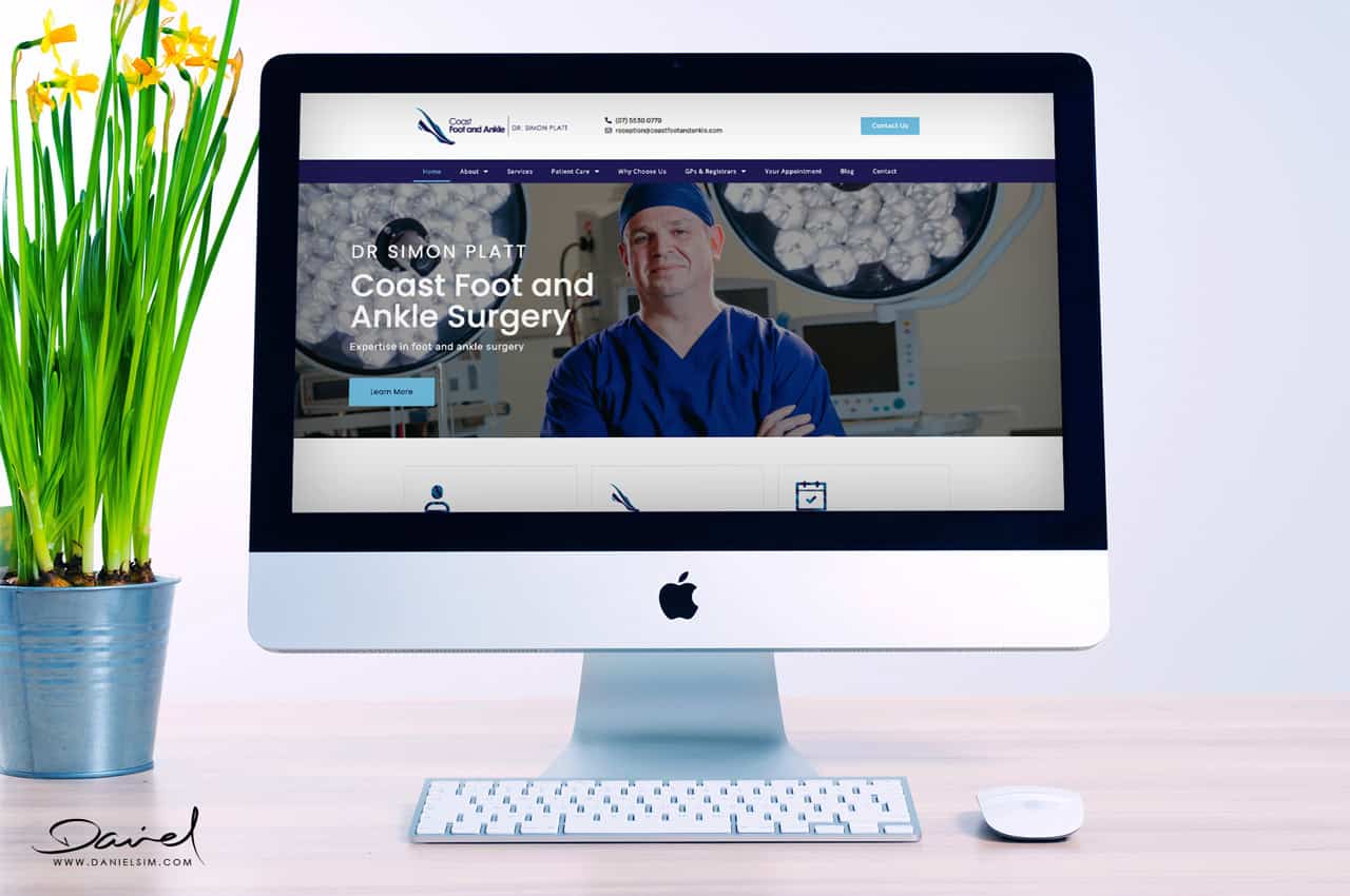
Think of your logo as your medical practice personality. A medical logo is a visual summary of who you are as a medical practitioner; a subliminal message about the experience your patients can expect.
Now, that’s asking for a lot of meaning to be packed into a very small space. For a really successful and powerful medical logo, a good designer uses every tool available. A great designer will be able to explain to you what each of the elements conveys, and how they all come together to tell your brand story.
Any logo, particularly a medical logo, should be powerful enough for people to want to know more about you; to feel a sense of trust and safety, and to be confident that you’re expert, professional and trustworthy. Your logo also needs to be easily recognisable, so viewers can differentiate your brand at a glance. Most important of all, a medical logo needs to help patients connect with you.
Remember also, that every aspect of your presentation, branding and image is based on your logo. It’s the foundational style of your website, your stationery, and even your medical practice décor.
Achieving all that isn’t for the faint-hearted – nor is it the kind of design work you’d trust to an amateur. Think of some of Australia’s most readily recognised medical logos. The Royal Flying Doctor Service is a case in point. It brings together the key components of its service in the map of Australia, the classic Caduceus (entwined serpents around a winged staff) and the wings that symbolise flight. It’s powerful, centred and engenders confidence and stability.
As DSD designers, we take ultimate responsibility for producing the very best medical logo design to communicate your personality and value. However, the more you understand about medical logo design principles, the better able you’ll be a guide our thinking and to participate in the process. At Daniel Sim Design, we firmly believe that a collaborative approach achieves the best final result.

OUR FIRST PRINCIPLES FOR
Medical Logo Design
Regardless of the words you decide to incorporate in your logo, remember that before viewers read any words, their minds will have ‘read’ the design: colour, shape and overall visual ‘story’. If that first glance appeals, they will proceed to read the words. This is why we place so much emphasis on shape and colour in logo design. It’s your enduring visual signature.
At Daniel Sim Design, we lay the groundwork for great design by asking you detailed questions about your practice and yourself. The more detail you provide, the better will be our understanding. Many clients find these questions challenging, and some haven’t really analysed their ways of working and relating to patients to that level. But while it can be challenging, it’s also highly rewarding.
We encourage you to think about why you’ve chosen your particular branch of medicine, exactly what you do, your philosophy of patient care, and how you achieve your specific patient care goals. In other words, what makes you different? We need to understand as much as possible about your patients or clients – the people your logo will need to attract.
Importantly, we need to learn about your personality, your values, and your treatment style. All this information is critical to designing the best possible medical logo for you.
The DSD Medical Logo Design Process
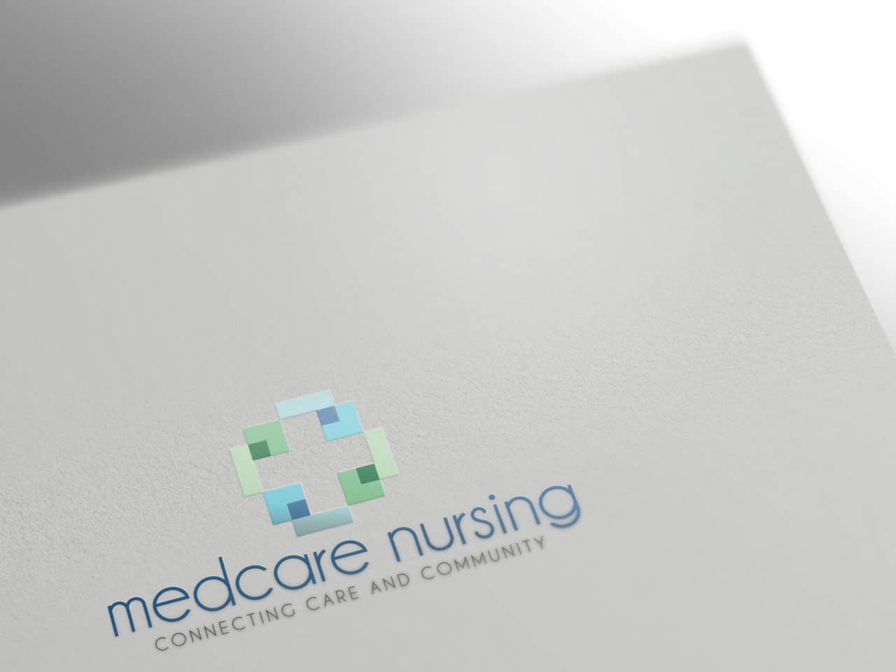
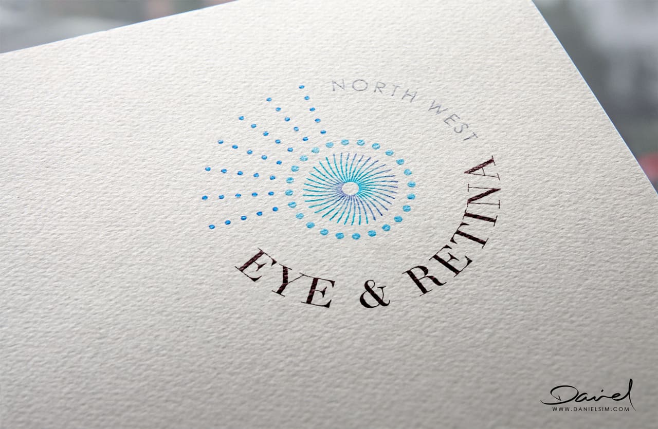
Once we understand your medical specialty and practice style, we start to conceptualise shapes that will reflect those key aspects of what you do. Simplicity is one of the best keys to immediate recognition, so we work to refine shapes to their simplest form. For a medical logo, we often use shapes as a stylised representation of a particular aspect of the human body. You can see an example of this here (link).
We work hard to avoid clichéd, over-used design elements, which are rife in medical logos. These elements can be so common that viewers simply ignore them. Put yourself in the shoes of an average person, with little medical background. The default view is usually that one medical practice is very like another – that is, until a specific service is needed. We work to ensure that our expert medical logo design readily differentiates your practice from others. We immerse ourselves in the competitive landscape to the extent that we’re aware of your competitors’ logos, and can avoid any ‘me-too’ similarities. We also rely on your understanding of your competitors’ services and style, and we ask that you offer us a clear explanation of how you differentiate yourself.
Fonts: If you’ve checked out some of the medical logos we’ve designed (link), you’ll have noticed that they use various fonts. Fonts (or typefaces) have personality, and as such, they send powerful subliminal messages about your medical practice to patients. Typeface is so important that some iconic brands have commissioned a fully-bespoke type as their logo. Think Coca-Cola or Carlsberg, for instance.
When All Is Said and Done…
The stories behind many of our medical logos explain why DSD has become a go-to design studio for medical logos. Our commitment to promoting health and wellbeing, and our deep interest in the ‘business’ of medicine mean that we have real empathy for medical practitioners who want to tell the story of their services in the best possible way.
As we get to know our medical clients, we’re impressed by their commitment to their patients’ wellbeing, to providing the best care possible. We recognise our clients as true experts in their field. In designing a medical logo, we strive to find ways to communicate all the attributes that make up your unique medical style.

