Logo Design for Footes Pharmacy
Rebrand: abstract FP forming hands and heart. care and love. Since 1983, high standing in community. Tagline creation.
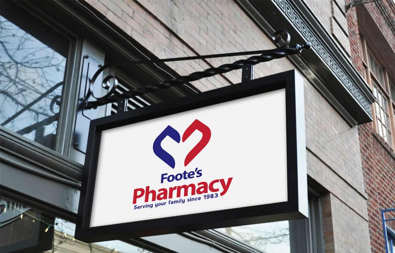
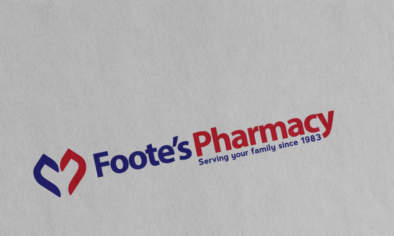
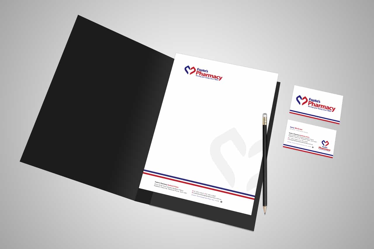
Foote’s Pharmacies are landmarks in their South Queensland communities, where they’ve been providing services since 1983. They asked us to contribute logo design and tagline creation to their overall rebranding exercise. Their brief was for simple branding that would help to communicate the hands-on caring approach of their pharmacists and staff. They also asked us to create great taglines that would communicate simple, clear messages to their clientele.
Clean.Simple
From a highly stylised representation of the “FP” initials came the idea of two hands forming a heart: the joint concept of ‘hands-on’ and ‘caring’.
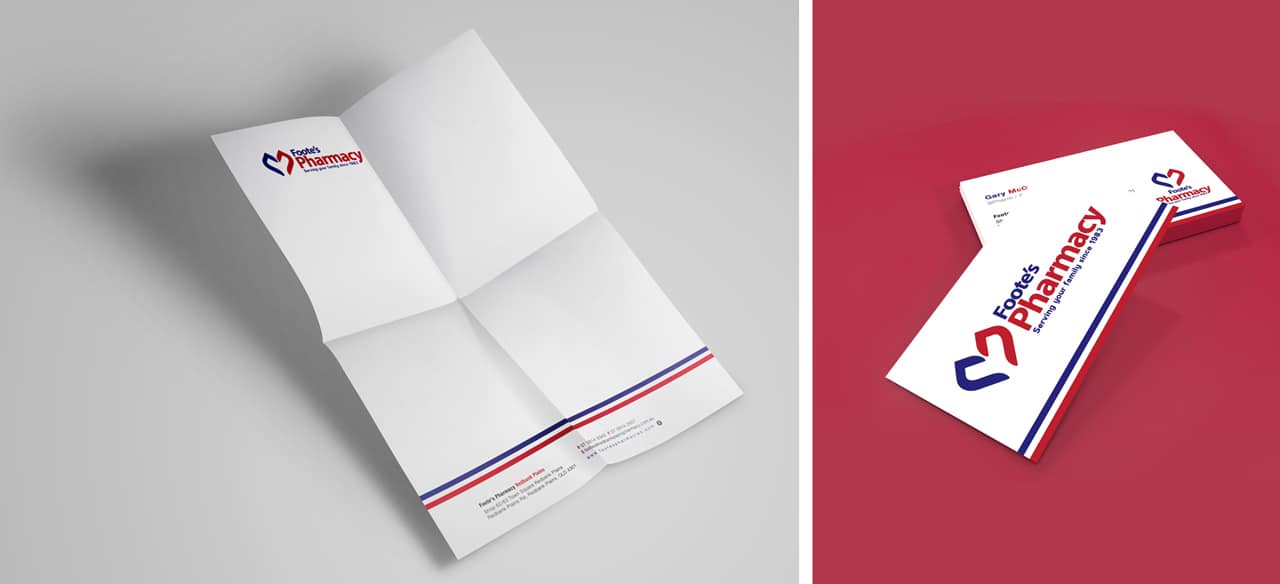
This could hardly be more simple, and yet it sends a very clear message about the welcome clients receive when they walk into a Foote’s Pharmacy. We created a negative space logo, and also worked with the strong corporate colours to create a full colour version for a white background.
In these days of multiple viewing requirements across a variety of media and devices, it’s critical that logos be transferrable, easy to recognise, and replicable across devices, media and situations. Graphics should be simple and memorable. Foote’s Pharmacy Logo ticks all those boxes.